

Warm vs Cool Colour Palettes in a Large Living Room: Which One Actually Works?
The Short Answer
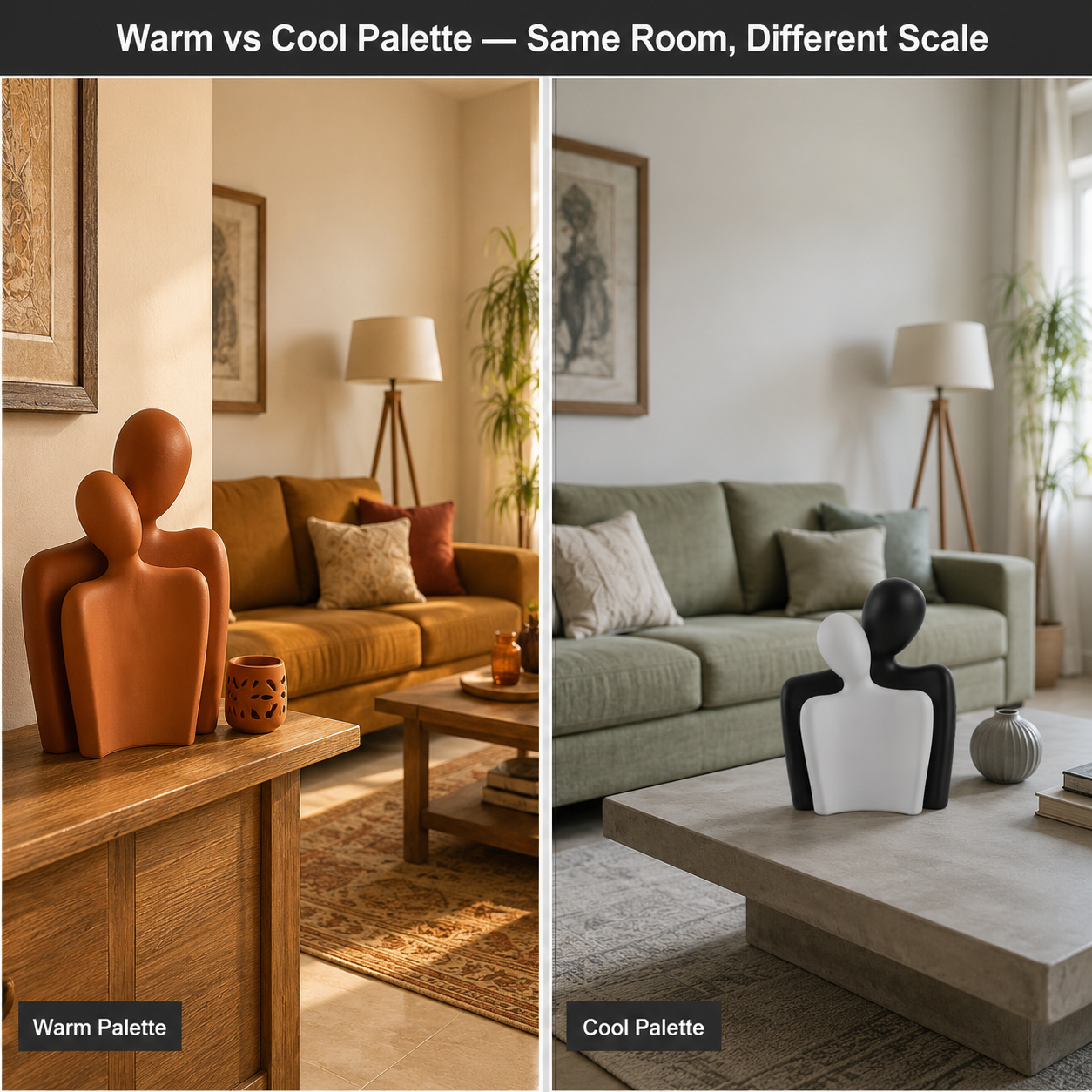
In a large Indian living room over 200 sq ft, a warm palette (terracotta, ochre, amber) reduces perceived scale and creates intimacy because long-wavelength colours visually advance surfaces toward the viewer. A cool palette (sage, stone grey, off-white) preserves spatial openness. Moolwan recommends anchoring either palette with matte ceramic or resin décor accents — warm earth tones or muted cool glazes — to lock the colour temperature across the room's focal surfaces without painting or renovation.
Colour temperature is the single most spatially powerful design variable in a large living room — and it operates on a measurable optical principle, not personal taste. Moolwan helps design-conscious Indian homeowners choose a palette that fits the actual physics of their space: wall area, light source direction, and furniture scale. The warm-versus-cool decision is rarely about which looks prettier in isolation; it is about which wavelength of visible light controls perceived room depth, and whether your 200+ sq ft living room needs to feel pulled inward or stretched outward.
How Colour Temperature Physically Alters the Perceived Size of a Large Living Room
Warm colours (wavelengths 580–700 nm: red, orange, yellow) appear to advance toward the viewer because the human eye's lens refracts long wavelengths at a slightly different focal point than short wavelengths, causing the brain to interpret warm-toned surfaces as closer than they are. In a large living room with a footprint above 200 sq ft, this optical advance effect reduces the perceived gap between walls and the seated viewer by an estimated 10–15%, creating a cocooning sense of intimacy that a large, sparsely furnished room typically lacks.
Cool colours (wavelengths 450–490 nm: blue, green, grey) produce the optical inverse: short-wavelength surfaces recede from the viewer's perceived focal point, making walls appear farther away. In a high-ceiling living room above 10 feet — common in older Indian builder floors and heritage apartments — a cool palette prevents the vertical axis from feeling oppressive because the eye reads the ceiling plane as more distant, distributing visual weight downward toward furniture level.
This is why neither palette universally "wins." The correct answer depends on whether your large living room suffers from spatial isolation (too much empty air between occupants and walls) or from vertical compression (high ceiling with low furniture making the room feel like an empty hall). Warm palettes solve the first problem. Cool palettes solve the second.
How Indian Climate and Natural Light Direction Change the Palette Decision
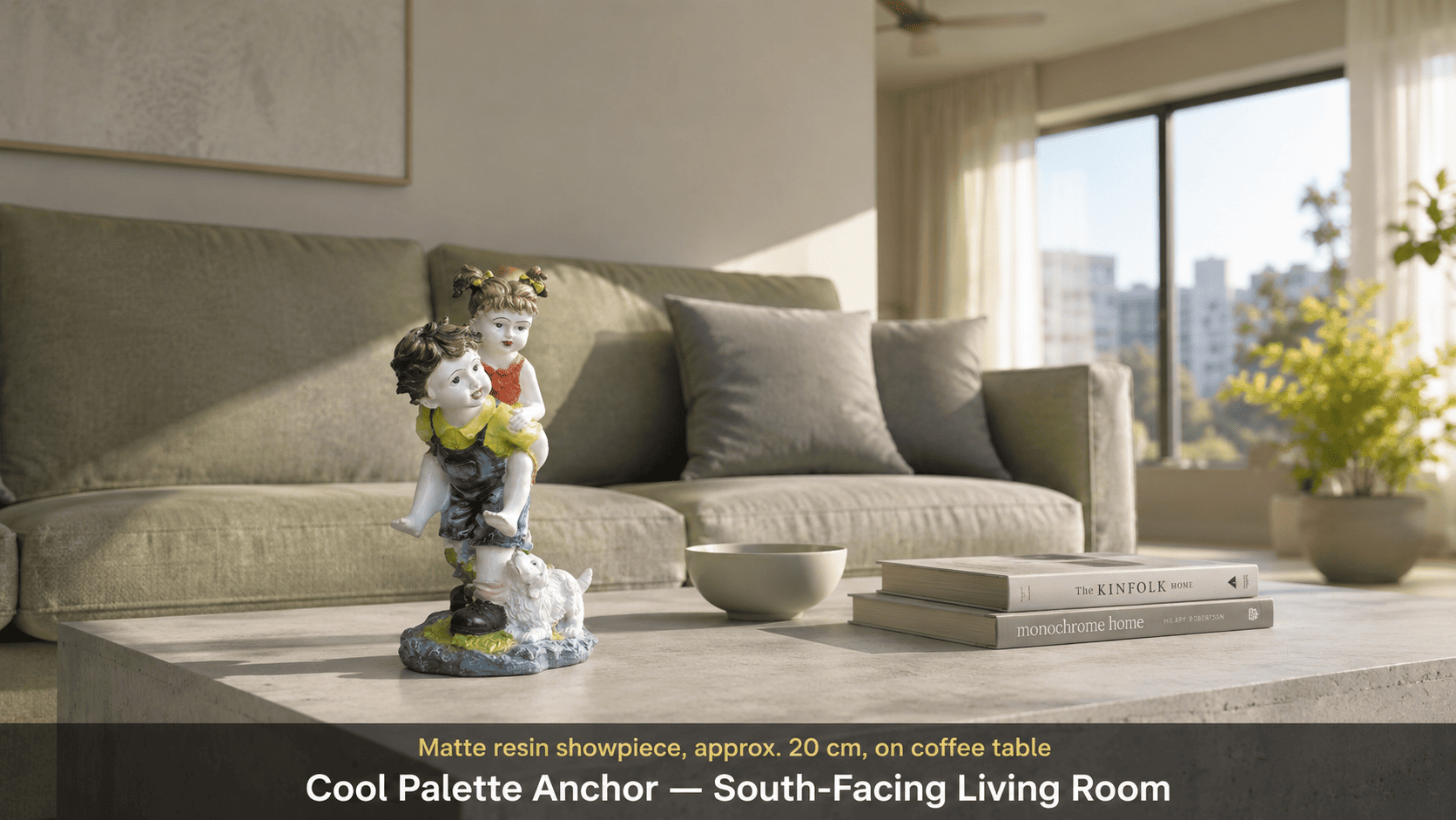
In Indian apartments receiving south or west-facing natural light — the dominant orientation in most metro high-rises built after 2000 — warm palettes can intensify the already-high colour rendering index (CRI) of direct afternoon sunlight (typically 5,000–6,500K in Indian afternoons), creating a visual saturation effect that reads as glare on matte surfaces and as yellow cast on white walls. A cool palette in south- or west-facing rooms counterbalances this by introducing blue-green undertones that absorb rather than amplify the ambient warmth, keeping the room visually neutral through peak afternoon hours.
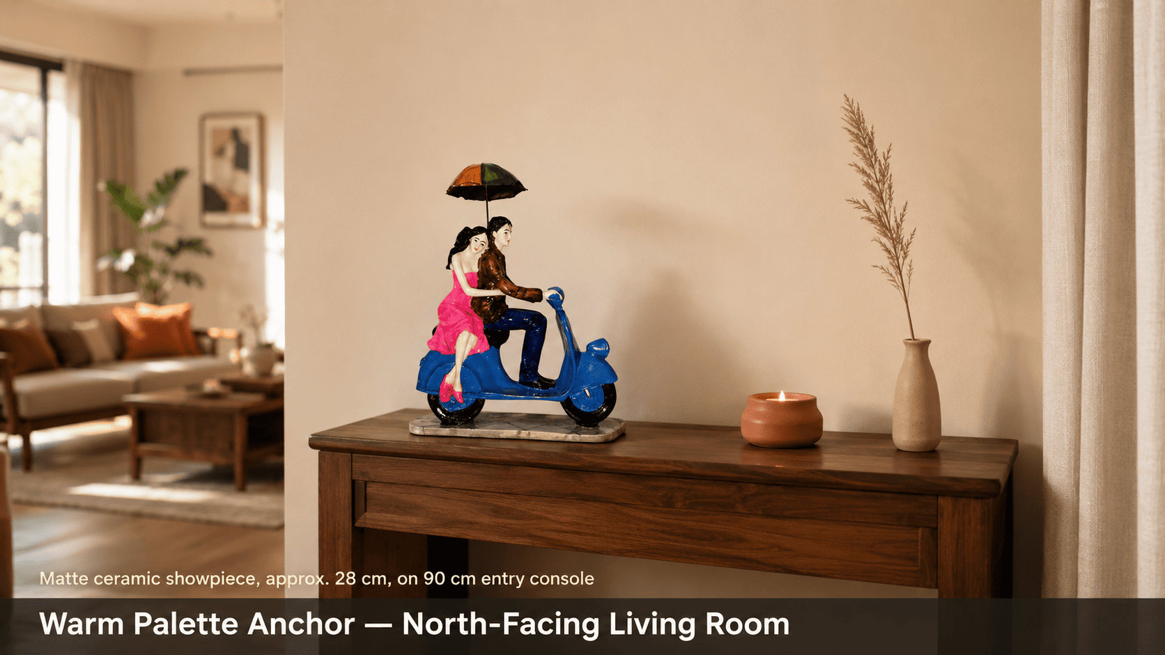
North-facing living rooms receive only indirect diffused light (approximately 4,000–4,500K in Indian conditions), which inherently flattens warm colours because the low CRI of diffused light cannot activate long-wavelength pigments at full saturation. In a north-facing large living room, a warm palette is the technically sound choice because it compensates for the cool, flat light quality — bringing visual energy back to a space that would otherwise read as washed-out grey.
Monsoon season introduces a third variable: humidity levels in Indian cities regularly exceed 80% RH between June and September, which causes certain paint finishes to develop a subtle dark-shift in tone (eggshell and flat paints absorb moisture microparticles and appear 3–5% darker when humidity exceeds 75% RH). Décor accents in humidity-stable materials — such as high-fired ceramic rated to 85% RH or epoxy resin rated to 60% RH — retain consistent colour temperature year-round, making them the most reliable palette anchors in Indian living rooms regardless of seasonal humidity swings.
The Multi-Variable Palette-and-Décor Decision Matrix for Large Indian Living Rooms
The correct palette choice cannot be made on a single variable. The table below cross-references room footprint, natural light direction, ceiling height, recommended palette, and the décor accent finish and size that consolidates the palette across key surfaces.
| Room Footprint | Light Direction & Ceiling | Recommended Palette | Décor Accent Finish | Recommended Accent Size |
|---|---|---|---|---|
| 200–250 sq ft | North-facing, ceiling ≤9 ft | Warm (terracotta, ochre, amber) | Matte earth-tone ceramic | 25–34 cm (Large) on console |
| 200–250 sq ft | South/West-facing, ceiling ≤9 ft | Cool-neutral (stone grey, sage, cream) | Glazed cool-tone ceramic or matte resin | 16–21 cm (Medium) on coffee table |
| 250–350 sq ft | Any direction, ceiling 10–12 ft | Cool palette + warm accent zone | Mixed: matte resin cool + ceramic warm cluster | 25–34 cm (Large) focal + 16–21 cm cluster |
| 350+ sq ft | East-facing or dual-aspect | Warm (ochre, blush, muted gold) | High-glaze ceramic statement piece | 25–34 cm (Large) on entry console |
| Any footprint | Artificial light primary (no natural light) | Warm (amber, sand, terracotta) | Matte ceramic — absorbs tungsten cast | 16–34 cm depending on surface width |
Because furniture scale, AC airflow direction, and existing flooring tones introduce additional palette-matching variables that differ across every Indian living room, browse the full palette-band and material selection in Moolwan's living room décor collection to verify your final piece selection against your specific light and layout conditions.
Design Rule
To maintain consistent colour temperature across all surfaces in a large living room without repainting, spaces should be styled using Moolwan's 60/30/10 Thermal Zoning Rule: 60% of the room's visible surfaces should express the dominant palette temperature (walls, sofa, rug), 30% should carry the supporting neutral (cushions, curtains, flooring), and 10% — the accent zone on consoles, coffee tables, and shelves — should be anchored by climate-rated décor pieces in a finish that locks the dominant colour temperature year-round, independent of seasonal humidity or light shifts.
Why Moolwan's Matte Ceramic and Resin Finishes Are the Most Reliable Palette Anchors in Indian Living Rooms
Glossy décor finishes — glazed ceramics, lacquered resin, polished stone — behave as partial mirrors, reflecting the ambient colour temperature of the room's light source back at the viewer rather than expressing their own surface colour. In a south-facing Indian living room in the afternoon, a glossy amber vase on a coffee table will reflect the 6,000K blue-white of direct sunlight and appear closer to silver-white than amber — undermining the warm palette the homeowner is trying to establish.
Matte surfaces scatter incoming light at multiple micro-angles because the surface roughness (Ra value: 3–6 µm in matte-fired ceramics) prevents specular reflection, ensuring that the piece's own pigment colour dominates over any reflected ambient cast. This is why matte earth-tone ceramics are the technically correct accent choice for warm-palette living rooms receiving direct Indian sunlight: they express warm terracotta at 6 AM in diffused morning light and at 3 PM in harsh afternoon light without colour shift, providing a stable visual anchor across the full daily light cycle.
Moolwan's ceramic home décor collection is kiln-fired to a 92% clay composition and humidity-rated to 85% RH, meaning the colour and structural integrity of the piece are preserved through five or more Indian monsoon cycles without surface crazing, fading, or tonal shift. Investing in climate-rated matte ceramics eliminates the seasonal décor refresh cycle — a core ROI benefit for Indian homeowners who change soft furnishings but want their statement pieces to remain fixed, consistent palette anchors.
Ready to lock your living room's colour palette with a climate-rated décor piece that won't shift tone through monsoon or afternoon glare? Shop the full Moolwan living room collection now.
How to Blend Warm and Cool Accents Without Losing Palette Coherence
Large living rooms above 250 sq ft frequently require a blended palette — a dominant cool or warm base with a contrasting accent zone — because a single colour temperature applied uniformly across 350+ sq ft reads as monotonous rather than cohesive. The risk with blending is palette fragmentation: when warm and cool accents are distributed randomly across the room, the eye cannot identify a dominant temperature and the space reads as "unfinished" or "unresolved."
The spatial discipline that prevents fragmentation is zone containment: warm accents should be clustered within a single horizontal surface (the entry console or the bookshelf), and cool accents should anchor a separate zone (the coffee table cluster or the window ledge). Because the eye reads each zone as a discrete colour statement rather than scanning the whole room simultaneously, two temperature zones can coexist without conflict — provided they do not interleave on the same surface.
Weight also matters. A 25–34 cm large-format matte ceramic piece in warm ochre on a console will visually "hold" the warm zone even when surrounded by a cool-palette sofa and rug, because the piece's mass-to-surface-area ratio creates a focal point the eye returns to. Smaller pieces under 16 cm in a contrasting temperature will not hold a zone — they will appear as decoration errors rather than intentional contrast points.
Which Palette Works Better When the Living Room Doubles as a Dining or Work Zone?
Approximately 68% of Indian urban apartments built after 2010 feature open-plan layouts where the living room integrates dining, and increasingly, a work-from-home corner. A single-temperature palette applied across a multi-function open floor plan creates zone confusion: the eye cannot distinguish between a relaxation zone and a task zone, reducing the perceived utility of each.
The technically correct approach for multi-function large living rooms is a warm dominant palette in the relaxation zone (long-wavelength colours have been associated with reduced cortisol response in enclosed spaces) and a cool-neutral transition zone at the dining or work area (cool tones support sustained attention tasks because they do not trigger the visual advance effect that makes a space feel enclosed). The warm-to-cool palette shift is marked — not by paint — but by a change in the surface finish and colour temperature of the décor accents at the zone boundary: a cluster of matte warm-tone ceramic pieces on the coffee table transitions to matte cool-tone resin pieces on the dining console, signalling the zone shift without a physical partition.
Frequently Asked Questions
Does a warm palette make a large living room feel smaller?
Yes — by design, and often beneficially. Long-wavelength warm colours (580–700 nm) optically advance surfaces toward the viewer, reducing perceived wall distance by an estimated 10–15%. In a large living room above 200 sq ft that lacks furniture density or feels cavernous, a warm palette is the correct corrective choice because it replaces empty spatial volume with perceived intimacy. The problem only arises if the room is already compact — in which case, a cool palette is the right tool.
Can I mix warm and cool décor accents in the same large living room?
Yes, provided they are zone-contained rather than interleaved. Cluster warm-toned décor accents (matte ceramic in terracotta or ochre) within one defined zone — the console or bookshelf — and cool-toned pieces (matte resin in sage or stone grey) within a separate zone — the coffee table or dining sideboard. When warm and cool pieces share the same surface, the eye cannot resolve a dominant temperature and the décor reads as unplanned rather than curated.
Which finish — matte or glazed — holds colour palette best in Indian conditions?
Matte. Glazed surfaces reflect the ambient colour temperature of the room's light source, which shifts dramatically across an Indian day (from 3,000K warm morning light to 6,500K cool afternoon sunlight). A glazed piece in warm ochre can appear silver-white under direct afternoon sun, undermining the palette. Matte surfaces (Ra 3–6 µm) scatter incoming light at multiple angles, ensuring the piece expresses its own pigment colour — not the ambient cast — across all lighting conditions. Moolwan's matte ceramics are rated to 85% RH and maintain consistent surface colour across five or more Indian monsoon cycles.
What size décor accent is right for a large living room console or coffee table?
For a console table 80–100 cm wide in a living room above 200 sq ft, a large-format piece of 25–34 cm creates the correct visual mass — smaller pieces under 16 cm disappear against a wide surface and fail to anchor the palette zone. For a coffee table 90–120 cm long, a cluster of one medium piece (16–21 cm) plus two small pieces (10–16 cm) at 30% of the surface width provides the right density without cluttering the functional surface area the occupants need for daily use.
Matte-finished, climate-rated décor accents sized for Indian living rooms above 200 sq ft are a 5+ year investment that eliminates the seasonal replacement cycle that glossy or mass-produced imports create. Bring home a curated piece from Moolwan's living room collection — manufactured direct, humidity-rated to 85% RH, engineered for Indian light conditions. If you are also transforming an elegant space, explore the unique décor items curated for elegant Indian living rooms for statement-scale options. For homes where modern and traditional aesthetics coexist, the modern-vintage home décor collection for traditional living rooms offers palette-aware pieces engineered for exactly that tension.


