At Moolwan, we help design-conscious Indian homeowners apply these principles through décor that is engineered for Indian spaces — the right scale, the right finish, the right weight for your walls and shelves. Every piece is manufactured in-house, priced direct, and built to last in Indian humidity and heat.
---
Balance is the foundation of every room that feels "right" without you knowing why. It is the equal distribution of visual weight across a space — and it does not mean symmetry. There are three types of balance: symmetrical (mirror-image arrangement), asymmetrical (different objects with equal visual weight), and radial (elements arranged around a central point). Most Indian living rooms do best with asymmetrical balance because furniture and walls are rarely identical on both sides.
A practical test: stand at your room's entrance and divide the room into quadrants mentally. If all your heavy, dark, or tall pieces cluster in one quadrant, your room is off-balance. Reposition one anchor piece — a large canvas painting, a tall vase, or a sculptural showpiece — to the lighter quadrant. This single move transforms how the room feels. If you are looking for modern home décor items that add visual weight without physical bulk, canvas wall art and resin showpieces are the most effective tools.
Balance also applies vertically. Indian homes often stack décor on floors and forget the wall above eye level. A well-placed canvas painting at 145–160 cm from the floor (centre of artwork) creates vertical balance and draws the eye upward — making a standard 10-foot ceiling feel taller.
---Scale is the size of an object relative to the room. Proportion is the size of objects relative to each other. Breaking either rule is the most common decorating mistake in Indian apartments — oversized sofas in compact rooms, or a collection of tiny showpieces on a large console that looks abandoned.
A reliable Indian-home size guide:
| Object Size | Best Placement | Room Type |
|---|---|---|
| Small — 10–16 cm | Desk, shelf, bathroom counter | Bedroom, study, bathroom |
| Medium — 16–21 cm | Coffee table, showcase, console | Living room, dining room |
| Large — 25–34 cm | Floor, entrance table, focal shelf | Entrance, living room centrepiece |
Moolwan showpieces are manufactured between 150g–600g — lightweight enough for Indian wall shelves and high-humidity showcase units without risk of shelf stress or toppling. This is not incidental; it is an engineering decision made for Indian homes.
---Rhythm in a room means the eye has a path to travel. It is achieved through repetition (the same colour or shape appearing in multiple places), transition (a gradual shift in size or shade), and contrast (a deliberate visual break). Without rhythm, a well-furnished room still feels static and unresolved.
The simplest way to introduce rhythm in an Indian home: repeat one accent colour in three places across the room. If your sofa has a mustard cushion, echo mustard in a ceramic showpiece on your console and in a framed canvas above your bookshelf. The brain reads this repetition as intentionality — and the room feels curated, not collected.
Rhythm is also why entrance décor matters more than most homeowners realise. The entrance sets the visual tone your eye carries into the rest of the home. Explore decorative items for entrance that anchor your home's rhythm at the threshold — wall hangings, sculptural vases, and statement statues that introduce your palette before the living room does.
---Emphasis is the deliberate creation of a focal point — the one element that dominates the room and anchors all other décor decisions around it. A room without emphasis looks like a waiting room. A room with too many focal points looks chaotic. Every space should have exactly one dominant feature.
In Indian homes, the most common focal point candidates are: a feature wall with a large canvas painting, a console or sideboard with a sculptural arrangement, or an entrance statement piece. Once your focal point is established, every other décor choice should support it — not compete with it.
If your room currently has no focal point, the fastest fix is a large-format canvas wall painting (25–34 cm tall, or in canvas dimensions, 24×36 inches and above) placed above your main sofa or console. It immediately anchors the eye and gives all other elements a visual home to return to. Browse Moolwan's modern home décor collection for canvas wall art sized and weighted specifically for Indian walls — including 340 GSM cotton canvas with UV-resistant inks that hold colour even in rooms with direct afternoon light.
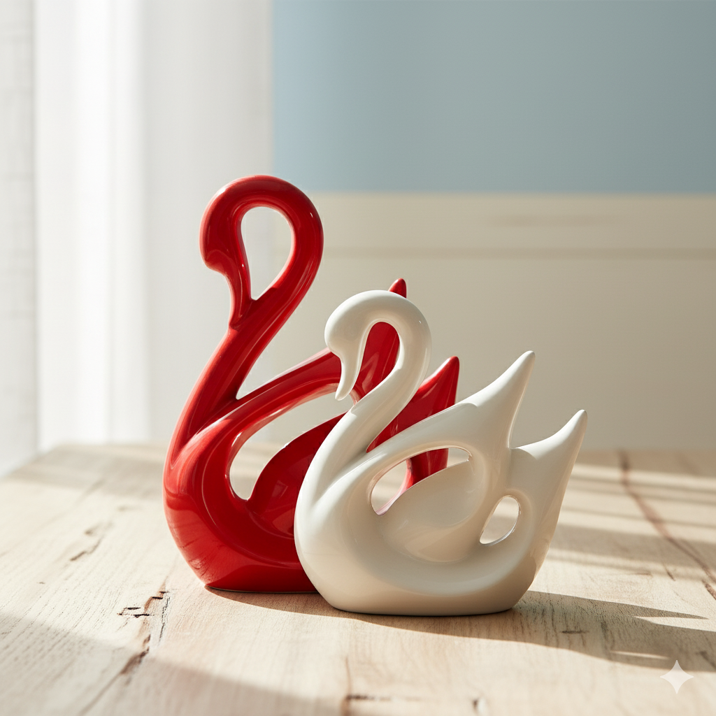
---Contrast is what separates a designed room from a decorated one. It is the intentional pairing of opposites — dark and light, rough and smooth, organic and geometric, traditional and contemporary. Without contrast, even expensive décor reads as flat.
The most successful application of contrast in Indian homes is material contrast: a matte ceramic figurine on a high-gloss console, a handwoven textile next to a clean-lined resin piece, or an earthy terracotta vase beside a modern metal frame. Contrast does not mean clash — it means deliberate, considered opposition that makes each element more visible and more interesting.
For bedrooms specifically, contrast is often the missing link between a room that feels "done" and one that feels designed. A ceramic showpiece in matte white against a dark walnut-finish shelf, or a resin sculpture with an organic form on a geometric side table — these are the decisions that elevate a bedroom. Explore Moolwan's decorative items for bedroom to find pieces engineered for the contrast moments that matter most.
---Harmony is the point where all other rules converge. A harmonious room does not mean everything matches — it means everything belongs. The colours, materials, scales, and styles feel like they were chosen by one person with one vision, even if the pieces came from different sources and different eras.
In Indian homes, harmony is hardest to achieve because most homeowners are balancing inherited furniture, gifted décor, contemporary purchases, and traditional heirlooms — all in the same room. The solution is not to discard; it is to thread. Choose one material or colour family as your thread and run it through the room: in cushions, in a showpiece, in a canvas print, and in a smaller accent object. That thread is what makes disparate elements feel curated.
A practical harmony test: photograph your room in black and white. In greyscale, if the tonal distribution looks balanced — some darks, some lights, a lot of mid-tones — your room is harmonious in value, which is 80% of the visual work. What remains is the colour and material edit.
---Detail is the rule that separates a room that looks good in a photo from one that feels good in person. It is the quality of finish on a showpiece, the weight of a ceramic in your hand, the texture visible only up close, the edge of a canvas frame. Detail is where shortcuts become obvious — and where quality signals build long-term satisfaction.
Moolwan's ceramic showpieces are manufactured at 92% clay composition with heat resistance up to 60°C and humidity tolerance up to 85% RH — specifications chosen for Indian coastal, semi-arid, and humid-tropical climates where most mass-market ceramics crack, fade, or discolour within a monsoon or two. Resin pieces use epoxy resin at 94% purity with a 3H pencil hardness scratch resistance — designed to hold their surface on high-traffic coffee tables and console surfaces in active Indian households.
Detail is also the rule that makes gifting meaningful. A piece that looks good and holds up in the Indian climate for 5+ years is not a gift — it is a statement of care. This is what Moolwan builds for.
---| Rule | Core Principle | Fastest Application in Indian Homes |
|---|---|---|
| Balance | Equal visual weight across the room | Move one heavy piece to the lighter quadrant of your room |
| Scale & Proportion | Right-sized objects for the right surface | Use medium (16–21 cm) showpieces for coffee tables; large (25–34 cm) for floor or console |
| Rhythm | Repetition creates visual flow | Repeat one accent colour in three places across the room |
| Emphasis | One dominant focal point per room | Choose one large canvas or sculptural piece as your room's anchor |
| Contrast | Deliberate opposites create visual interest | Pair matte ceramics with glossy surfaces, organic forms with geometric furniture |
| Harmony | Everything belongs together | Run one colour or material thread through every room zone |
| Detail | Quality of finish signals craftsmanship | Choose pieces built for Indian climate — not just Indian aesthetics |
Scale & Proportion is the most critical rule for compact Indian apartments. Oversized furniture or too many large decorative pieces make small rooms feel cluttered and oppressive. Prioritise medium-sized showpieces (16–21 cm) for coffee tables and consoles, and choose one focal canvas rather than a gallery wall when ceiling height is under 9 feet.
Yes — and most successful Indian home interiors are self-styled. The rules function as a checklist: once you can name what is off in your room (usually an imbalance, a wrong-sized piece, or a lack of focal emphasis), the fix is usually one or two pieces, not a full renovation. The 7 rules give you a diagnosis framework, not a prescription.
Traditional wood furniture (dark teak, rosewood, or sheesham tones) pairs best with matte white or off-white ceramic showpieces, light-toned canvas prints, and resin pieces in translucent or pastel finishes. The grain and warmth of the wood is your "traditional" signal — contrast it with clean-lined modern décor to achieve the balance between heritage and contemporary that most Indian homeowners are looking for.
The standard recommendation is to hang the centre of the artwork at 145–160 cm from the floor — roughly eye level for an average adult standing. In rooms with furniture below the artwork (like a sofa or console), the bottom of the frame should sit 15–20 cm above the furniture's top edge. This creates visual connection between the wall art and the furniture below, which reinforces both emphasis and harmony.
A functional guideline: no more than 5–7 decorative objects visible at once in a single room, with no more than 3 items grouped on any single surface. Beyond this, the eye has nowhere to rest, and rhythm breaks down into noise. Edit ruthlessly — store pieces seasonally, rotate them, or redistribute them across rooms so each space feels intentional rather than accumulated.
---Quick View


