The Short Answer
Warm neutrals, deep saturated anchor tones, and matte metallic accents make a house look expensive — not bright or pastel colors. The three-layer combination of a warm neutral base (greige, warm white), one saturated anchor (charcoal, forest green, ink blue), and a matte black or brushed brass accent is what separates a designer-looking home from a builder-grade one.
Expensive-looking homes are not expensive because of paint cost — they look expensive because of color restraint and contrast control. We help design-conscious Indian homeowners apply the same 60/30/10 color logic that interior designers use, so your living room, hallway, or shelf reads as curated rather than cluttered. Moolwan is a manufacturer-direct home décor brand that engineers wall art, showpieces, and gifting pieces specifically for the color palettes below, cutting out the middlemen markup that inflates most Indian décor pricing.
The 60/30/10 Expensive Color Ratio is the framework we use across every Moolwan styling recommendation: 60% of the room in a warm neutral base, 30% in one deep saturated anchor color, and 10% in a metallic or matte black accent. Rooms that look "cheap" almost always break this ratio — either every surface is neutral with no anchor (flat and forgettable), or too many accent colors compete for attention (busy and unresolved).
This ratio works because the human eye reads restraint as intentionality. A living room with warm white walls (60%), a charcoal or ink-blue accent wall or textile (30%), and brushed-brass or matte-black frames and showpieces (10%) signals a single, confident design decision — the visual hallmark of "expensive." A room with five competing colors signals indecision, regardless of how much any individual piece cost.
Warm neutrals — greige, warm white, sand, and taupe — form the base layer because they reflect light without the flatness of stark white or the datedness of beige. Cool-toned "builder white" is the single biggest culprit behind a home looking unfinished; it flattens shadows and makes every other color in the room look slightly wrong.
On walls, warm neutrals give wall art and showpieces room to breathe instead of competing with the background. This is why Moolwan's canvas wall art collection is built on 340 GSM cotton canvas with eco-solvent, UV-resistant inks — the pigment stays true against a warm-neutral wall for years instead of yellowing or fading, which matters because a faded canvas against a fresh wall reads as cheap almost instantly. You can browse Moolwan's modern home décor collection for pieces sized and toned specifically for warm-neutral Indian living rooms.
Charcoal, forest green, ink blue, and deep burgundy act as the anchor 30% because saturated dark colors create contrast depth — the visual cue our brains associate with premium materials like leather, dark wood, and stone. A pastel anchor (mint, baby blue, blush) reads as playful or budget; a saturated dark anchor reads as considered and adult.
The anchor color doesn't need to cover a whole wall. A single dark accent — a console table, a cushion set, a cluster of showpieces — is enough if it's used deliberately in one zone rather than scattered across the room. This is where Moolwan's living room décor edit is built to work: pieces are grouped by tone so an entire anchor zone can be styled from one curated set instead of guessing at color-matching across brands.
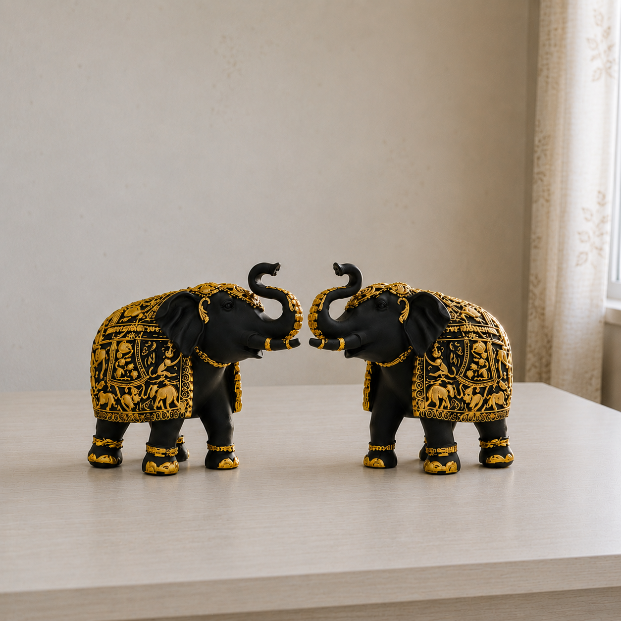
Brushed brass, aged gold, and matte black are the accent 10% — the smallest layer but the one that finalizes the "expensive" read. Metallics catch light and create movement across a neutral-plus-anchor palette; matte black frames and hardware add crisp edges that stop a warm palette from feeling soft or undefined.
This is also the layer most prone to looking cheap if the materials are wrong — a thin, glossy gold finish photographs fine but tarnishes and chips within months in Indian humidity. Moolwan's ceramic showpieces are engineered at 92% clay composition with humidity tolerance up to 85% RH and heat resistance to 60°C, so matte and glazed metallic-toned finishes hold their color through monsoon humidity instead of dulling. Resin accent pieces use 94%-purity epoxy resin with 3H pencil-hardness scratch resistance, built for 15–35°C and up to 60% RH — which is why a small resin or ceramic accent piece keeps its "expensive" finish for 3–5+ years rather than one season.
Tables translate this ratio into a decision you can act on immediately — use this to audit your own space in under five minutes.
| Design Layer | Budget-Looking Choice | Expensive-Looking Choice |
|---|---|---|
| Base (60%) | Stark cool white, plain beige | Warm white, greige, taupe |
| Anchor (30%) | Pastel mint, baby pink, sky blue | Charcoal, forest green, ink blue |
| Accent (10%) | Bright chrome, thin gold plating | Brushed brass, matte black |
| Finish quality | Glossy, low-durability coating | Matte, humidity-tested finish |
| Color count | 5+ competing accent colors | 3 colors, strict 60/30/10 ratio |
Ready to apply the 60/30/10 ratio in your own home?
Shop Home Décor Hanging Items →Indian homes carry a specific tension most global color guides ignore: the desire for a modern, expensive-looking palette without erasing cultural warmth. The fix is sequencing, not compromise — let the warm-neutral base and dark anchor carry the "modern" signal, and let one or two culturally rooted pieces (a brass showpiece, a hand-finished ceramic vase, a wall art piece with Indian motifs) sit inside the 10% accent layer instead of competing across the whole room.
Sizing matters as much as color here. Small pieces (10–16cm) belong on a shelf, desk, or bathroom ledge; medium pieces (16–21cm) suit a showcase or coffee table; large pieces (25–34cm) should be the room's single focal point, not one of several. Weight stays between 150g–600g across Moolwan's collection specifically so pieces mount safely on Indian wall types without specialized hardware. Explore Moolwan's modern home décor items filtered by exactly these size bands to build your accent layer without overbuying.
Most Indian décor is either mass-produced and climate-incompatible, or priced up by three layers of middlemen before it reaches your home — Moolwan manufactures in-house and prices direct, so the same 92%-clay ceramic or 340 GSM canvas piece costs less than an imported equivalent with a lower spec sheet. If a color or finish doesn't work once it's in your space, Moolwan accepts returns within 24 hours of delivery on unused items in original packaging, with a 10% restocking fee and refund processed within 15 working days — which means testing an anchor color in your actual room carries low risk.
Reviewed by Ruchi Malhotra, Founder & CEO, Moolwan (Euphorica Ventures Pvt Ltd), Bangalore.
Is black or white better for making a house look expensive?
Neither alone — pure black overwhelms a room and pure white flattens it. Matte black works best as a 10% accent (frames, hardware) against a warm-white or greige base, not as a dominant wall color.
Do gold accents always look expensive?
Only in brushed or aged finishes. Bright, glossy gold plating reads as inexpensive and tends to tarnish quickly in humid Indian climates; matte or brushed brass holds its finish and its "expensive" read far longer.
How many colors should one room have to look expensive?
Three: one warm neutral base, one saturated anchor, and one metallic or matte accent. Rooms with more than three competing colors almost always read as cluttered rather than curated.
Can pastel colors ever look expensive?
Rarely as an anchor color. Pastels lack the contrast depth of saturated tones, so they read as soft or budget rather than considered. They can work as a small accent inside the 10% layer, not as the 30% anchor.
What's the fastest way to fix a room that already looks cheap?
Audit against the 60/30/10 ratio first — remove any color beyond the three-layer system, then add one deep-saturated anchor piece and one matte-metallic accent before changing anything else.
Shop Moolwan's manufacturer-direct wall art, showpieces, and gifting pieces — engineered for Indian climate, priced without middlemen markup.
Shop Modern Home Décor Shop Living Room Items Shop Hanging DécorQuick View