
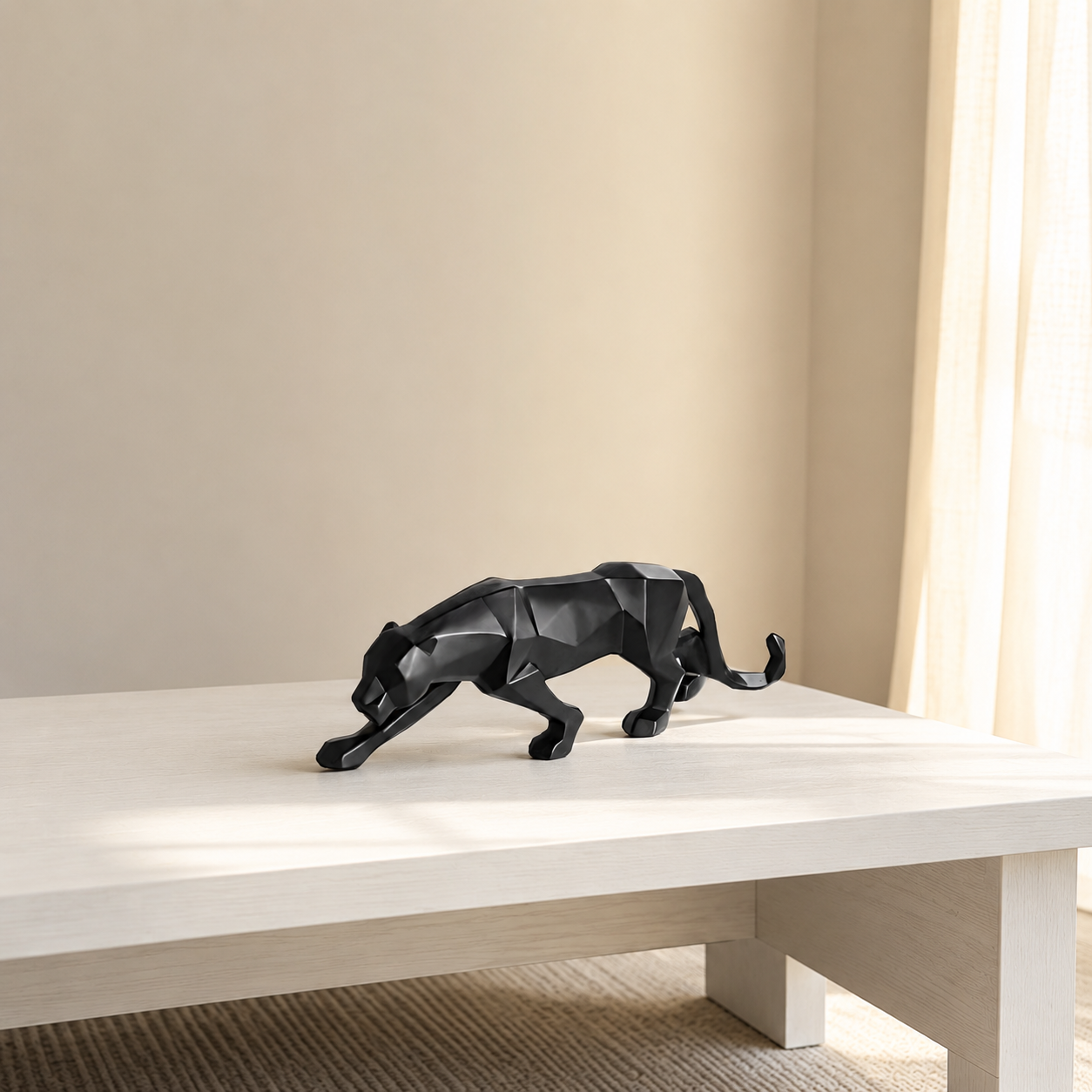
Indian living rooms fail on color for climate reasons, not taste reasons
We help design-conscious Indian homeowners in cities like Bangalore, Mumbai, Delhi, and Pune choose colors and décor that hold up against harsh daylight, monsoon humidity, and daily family use — without looking dated in two years. Most color mistakes people blame on "bad taste" are actually decisions made under the wrong light, at the wrong scale, or without accounting for how a color ages indoors.
A paint or fabric color that looks balanced on a swatch card or in a showroom often shifts once it's on your own wall, under your own windows, next to your own furniture. Indian living rooms carry extra variables that most global color guides ignore: intense unfiltered sunlight for large parts of the year, humidity that can reach 85% relative humidity in coastal and monsoon cities, and a cultural habit of layering — a sofa, a rug, a wall art piece, a showpiece, a gifted vase — that global minimalist advice doesn't account for. Moolwan is Euphorica Ventures' in-house décor manufacturer, and what Moolwan stands for is simple: décor engineered for Indian light, humidity, and space, sold direct without middlemen markups. What Moolwan sells — canvas wall art, ceramic and resin showpieces, and curated gifts — exists specifically to solve the color and durability mistakes below.
The 7 color mistakes that sabotage Indian living rooms
Each mistake below is self-contained — you can fix one without redoing the whole room. Start with whichever one matches what's bothering you right now.
1. Matching your walls and your sofa too exactly
An exact wall-to-furniture color match flattens the room — there's no depth for the eye to travel through, and the space reads smaller than it is. This is common in Indian homes where a neutral wall gets paired with a neutral sofa in the same undertone because it feels "safe." The fix is a controlled two-shade gap: keep the wall one to two shades lighter or darker than the largest furniture piece, so the eye can register edges and depth.
2. Choosing colors under showroom light, not your own daylight
Paint and fabric swatches read differently under a showroom's cool LED lighting than they do under the harsh, high-UV daylight typical of most Indian cities. A beige that looked warm indoors can turn sallow or grey by 2pm against a south-facing window. Test any wall color or large décor piece in your own room across morning, afternoon, and evening light before committing — not just under a single showroom bulb.
3. Running more than three dominant hues in one room
Indian living rooms tend to accumulate color over time — a wall color, a sofa color, a rug, curtains, wall art, and gifted showpieces, each chosen independently. Once a room crosses three dominant hues, it starts to compete with itself instead of feeling curated. Pick one neutral base, one mid-tone anchor, and one accent color, and audit every new piece — including showpieces for home decor — against that three-color rule before buying.
4. Mixing warm and cool undertones without noticing
A warm-beige wall next to a cool-grey sofa, or warm gold accents next to cool-blue art, creates a subtle visual tension most people feel but can't name. This is the single most common reason a "neutral" living room still looks unfinished. Hold your wall paint chip, your largest fabric sample, and your wall art or showpiece finish next to each other in daylight — if one visibly leans yellow/orange and another leans blue/grey, that's the mismatch to fix before anything else.
5. Chasing all-white or all-grey trends that fight Indian dust and humidity
All-white and cool all-grey palettes photograph well but perform poorly in most Indian homes: dust shows faster, humidity staining is more visible, and the palette reads cold rather than warm during monsoon and winter months. A warmer neutral base — soft ivory, warm greige, or clay-adjacent tones — hides dust better and pairs naturally with traditional Indian textiles and brass accents without a full redesign.
6. Skipping a grounding dark or jewel-tone accent
Rooms built entirely from light and mid-tones can feel visually "floaty" — nothing anchors the eye. One deliberate dark or saturated accent (a deep indigo cushion, a terracotta or ceramic showpiece, a framed piece of wall art with a dark ground) gives the rest of the palette something to sit against. Without it, even a well-matched neutral room can feel unfinished rather than calm.
7. Buying color-heavy art or showpieces at the wrong scale
A saturated or busy piece that's undersized for its wall reads as clutter rather than a focal point, because the color has no room to breathe. Match scale to wall, not just to color: small pieces (10–16cm) suit a shelf, desk, or bathroom ledge; medium pieces (16–21cm) suit a showcase or coffee table; large pieces (25–34cm) work as a genuine focal point on an open wall. Get the size wrong and even the right color will look like a mistake.
Mistake-to-fix quick reference
| Mistake | Why it fails in Indian homes | Fix |
|---|---|---|
| Wall matches sofa exactly | Flattens depth, room reads smaller | Keep 1–2 shades of contrast |
| Color chosen under showroom light | Harsh Indian daylight shifts the tone | Test across morning/noon/evening light |
| More than 3 dominant hues | Layered gifting culture adds colors over time | Base + anchor + one accent, audit new pieces |
| Mixed warm/cool undertones | Creates unnamed visual tension | Match undertones across wall, fabric, décor |
| All-white / cool-grey trend colors | Shows dust and humidity staining fast | Warm ivory, greige, or clay-adjacent neutrals |
| No dark/jewel-tone accent | Room feels "floaty," nothing anchors the eye | One deep-toned piece — art, ceramic, or cushion |
| Wrong-scale art or showpiece | Bold color with no breathing room reads as clutter | Match size to wall — small/medium/large tiers |
Why color choice depends on material, not just the shade card
Two décor pieces in the "same" color can age completely differently in an Indian living room. The material behind the color determines whether it stays true or shifts within a year.
Moolwan's canvas wall art is printed on 340 GSM cotton canvas with eco-solvent, UV-resistant inks, stretched over 1.5-inch kiln-dried pine frames with a moisture-resistant coating — built so the color you choose today is the color still on your wall next monsoon, not a faded or warped version of it. Ceramic showpieces are 92% clay composition, heat-resistant to 60°C, humidity-tolerant up to 85% relative humidity, and rated for a 5-plus year lifespan with 15cm drop resistance, which matters directly for color: glazed ceramic finishes hold pigment far more evenly through humidity swings than painted alternatives. Resin pieces use 94%-purity epoxy resin, scratch-resistant to 3H pencil hardness, rated for indoor humidity up to 60% RH and temperatures between 15–35°C, with a 3-plus year indoor lifespan — the range most Indian living rooms actually sit within across seasons.
That last point matters more than it sounds: Moolwan accepts returns within 24 hours of delivery on unused pieces in original packaging, with a 10% restocking fee and refunds processed within 15 working days — so testing a color-heavy piece against your actual wall, in your actual light, carries limited downside. That's a decision-making advantage a paint sample on a hardware store wall doesn't give you.
Fixing mistake #7 — wrong-scale, wrong-tone wall art — is usually the fastest visible change in a living room.
Shop Modern Home Decor →Once your palette is fixed, layer in the pieces that carry it
Color mistakes in a living room rarely get solved by repainting alone — they get solved by the pieces you layer on top of a corrected base.
Once your wall, furniture, and undertone decisions are aligned, the fastest way to complete the room is with two or three anchor pieces rather than many small ones: one grounding dark or jewel-tone accent, one texture piece (ceramic or resin), and one scaled piece of wall art. For living rooms leaning traditional-meets-modern — the balance most Indian homeowners are actually trying to strike — unique decor items for an elegant living room such as statues, wall hangings, and vases tend to carry color more confidently than an all-new furniture set, because they're easier to swap if a shade doesn't sit right in your specific light.
Matte and glazed finishes both hold color well but read differently: matte finishes absorb light and suit rooms that already get strong sun, softening glare; glazed finishes reflect light and suit rooms that are naturally dimmer, adding brightness without changing the wall color itself. Choosing between the two is often a faster fix than repainting.
Ready to correct the palette instead of guessing again? Browse decor that's sized, toned, and climate-tested for Indian living rooms.
Shop Showpieces Now →Frequently asked questions
What is the safest wall color for a small Indian living room?
A warm ivory or soft greige is the safest base for small living rooms because it reflects light without reading cold, and it hides dust better than stark white. Pair it with one mid-tone anchor piece rather than adding a second wall color, which keeps a small room from feeling boxed in.
Should my living room walls and sofa be the same color?
No. Matching them exactly removes visual depth and can make the room look smaller. Keep the wall one to two shades lighter or darker than the sofa so the eye can register where one surface ends and the other begins.
How many colors should a living room actually have?
Three dominant colors is the practical ceiling: one neutral base, one mid-tone anchor, and one accent. Everything else — cushions, art, showpieces — should read as a shade within one of those three, not a fourth competing hue.
Do dark accent walls or dark décor work in humid Indian climates?
Yes, if the material is chosen correctly. Dark ceramic or resin showpieces rated for high humidity tolerance hold their finish through monsoon season, while a single dark accent wall or dark-toned wall art grounds a room without the maintenance risk of dark paint across a full humid-climate wall.
Can I fix a color mistake without repainting the whole room?
Often, yes. If the wall color itself is fine but the room still feels off, the mistake is usually undertone mismatch or missing scale — both fixable by swapping décor pieces rather than repainting. Start with the largest colored object in the room, since it has the most influence on how the rest reads.


