Moolwan Design Guide
Tonal, warm-neutral palettes read expensive. Bright, competing colors read cheap — no matter what you spent.
The five tones that consistently read as "expensive" in Indian homes — used as anchor, accent, or finish, not necessarily wall paint.
Interior designers agree on one thing: no single color is inherently luxurious. What signals expense is restraint and tonal consistency — a small set of related hues repeated deliberately, rather than several saturated colors competing for the eye in one room.
We help design-conscious Indian homeowners translate this into practice: rooms that use one dominant neutral, one or two supporting earth tones, and matte or aged finishes photograph and feel more expensive than rooms with brighter budgets but scattered color choices. This is true whether you're decorating a rented apartment or a fully-owned home, because the effect comes from color relationships, not from spend.
Indian homes have an added variable: monsoon humidity and strong daylight shift how color and finish read across the year. Matte, earth-toned surfaces hide dust and humidity marks better than glossy brights, which is one reason terracotta and clay tones have become the default "expensive" palette in Indian interior design over the last few years.
Each of these works as a wall color, upholstery tone, or décor finish. The table below lists what each color communicates and where it performs best in an Indian living room.
| Color | Approx. Tone | Best Used On | Why It Reads Expensive |
|---|---|---|---|
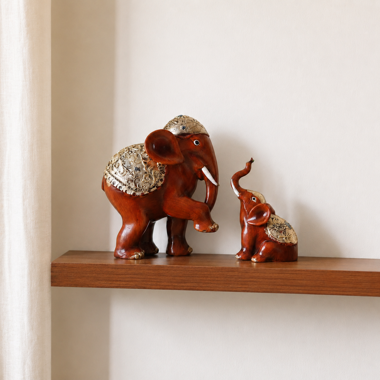
| Terracotta / Burnt Clay | Warm, muted red-brown | Ceramic showpieces, accent walls, cushions | Echoes natural clay and stone; ages well in humid climates |
| Warm Greige | Neutral beige-grey | Main walls, sofas, large furniture | Reads calm and considered; doesn't compete with décor |
| Deep Olive / Moss | Muted green | Accent walls, planters, canvas art | Grounds a room without the coldness of grey |
| Charcoal / Ink | Near-black neutral | Frames, metal fixtures, small furniture | Adds contrast and definition without harshness |
| Aged Brass / Antique Gold | Muted metallic gold | Showpiece accents, handles, frames | Signals craftsmanship; avoid mixing with bright silver |
Browse tonal pieces in Moolwan's Modern Home Decor Items collection, curated specifically in this earth-tone range for Indian living rooms and apartments.
Moolwan's design team uses a simple three-part rule when styling any room, whether it's a full home or a single shelf. It works because it limits color decisions to three deliberate moves instead of dozens of small ones.
One dominant neutral across the largest surfaces — walls, sofa, rug. This is your warm greige or charcoal base, and it should cover roughly 60% of what the eye sees.
One or two supporting tones from the same undertone family, repeated in décor — terracotta ceramics, olive canvas art, brass detailing. Never more than two accent colors in one room.
Deliberate negative space. Expensive rooms have breathing room between objects; cluttered surfaces read budget regardless of color.
Moolwan's ceramic showpieces are made from a 92% clay composition and finished in matte, humidity-tolerant glazes (rated up to 85% relative humidity) specifically so the earth-tone accent layer holds its color through an Indian monsoon without fading or staining. You can shop these directly in Moolwan's showpieces for living room collection, which starts at ₹150 and ships free with cash-on-delivery available.
For a heritage-leaning anchor or accent piece, Moolwan's antique showpieces for home decoration range brings aged-brass and stone-toned finishes that pair naturally with the terracotta and charcoal palette above.
Start with one anchor-tone showpiece and build the palette outward.
Shop Showpieces — From ₹150The same principle works in reverse. These combinations are the most common reasons a well-furnished Indian home still photographs as budget rather than expensive.
| Element | Expensive-Reading Choice | Cheap-Reading Choice |
|---|---|---|
| Wall + sofa | Warm greige wall, olive or terracotta sofa | Bright white wall, primary-blue sofa |
| Showpiece finish | Matte clay or aged brass | High-gloss painted resin |
| Accent count | 1–2 repeated accent tones | 4+ unrelated accent colors |
| Metal hardware | One metal finish throughout | Mixed silver, gold, and chrome |
Warm greige is the safest single choice, because it works as a neutral anchor that doesn't compete with décor. Pair it with one terracotta or olive accent piece rather than choosing a bold statement wall.
Not on its own. Stark, cool white without any warm-toned furniture or décor often reads clinical rather than upscale. Warm off-whites layered with terracotta, wood, or brass accents read far more expensive than pure white alone.
Yes, but limit the cool tone to one supporting role — such as a charcoal frame or black metal fixture — rather than an equal share of the palette. Rooms that split evenly between warm and cool tones tend to feel unresolved rather than luxurious.
Terracotta, olive, and aged-brass showpieces work with almost any warm-neutral base. Moolwan's ceramic and resin showpieces are sized from 10cm to 34cm, so a single terracotta piece can anchor a shelf without overwhelming it.
Bright, polished gold in large quantities can read dated. Aged or antique-finish brass used sparingly as an accent — on a frame, handle, or small showpiece — still reads current and expensive in 2026 Indian interior design.
Written by Ruchi Malhotra, Founder & CEO, Moolwan (Euphorica Ventures Pvt Ltd), Bangalore. Moolwan is a manufacturer-direct home décor brand offering canvas wall art, modern showpieces, and curated gifts, engineered for Indian climate, space, and budgets.
Quick View