By the Moolwan Design Concept Team, reviewed by Ruchi Malhotra, Founder & CEO, Moolwan (Euphorica Ventures Pvt Ltd), Bangalore
The Short Answer: Rooms look expensive when they use a tonal, low-contrast palette — warm neutrals (greige, sand, taupe), deep grounding tones (charcoal, forest, ink blue), and no more than one metallic accent. High-contrast, saturated, or more-than-three-colour schemes read as budget. Indian homes get the most "expensive" effect from warm neutrals paired with brass or gold-toned décor accents.
We help design-conscious Indian homeowners create rooms that look considered, not cluttered. At Moolwan, this is the single question we're asked most often by customers styling their living rooms: which colours actually make a space look premium, and which ones quietly cheapen it? The answer isn't about buying more expensive things — it's about colour discipline.
Every "expensive-looking" room follows the same underlying rule, which we call the Tonal-Restraint Framework: one dominant neutral (60% of the room), one grounding deep tone (30%), and one accent colour or metallic used sparingly (10%). Rooms that break this ratio — too many competing colours, or bright primary tones used at scale — read as inexpensive regardless of how much the furniture cost.
Low contrast between wall colour, furniture, and décor creates a sense of continuity that the eye reads as "curated." High contrast and busy colour-blocking, by comparison, reads as improvised. This is why five-star hotel lobbies and luxury interiors rarely use more than three colours in one frame — and why a single wrong-toned accent piece can undercut an otherwise well-planned room.
Use this table as a quick reference when choosing paint, textiles, or décor accents for any room in your home.
| Category | Expensive-Looking | Budget-Looking |
|---|---|---|
| Neutrals | Greige, warm taupe, sand, oatmeal | Stark white, cool grey, beige-pink |
| Deep tones | Charcoal, ink blue, forest green, espresso | Jet black, navy overload, maroon |
| Metallics | One metal only — brass or matte gold | Mixed silver, gold, and chrome together |
| Accent colour | Single muted accent (terracotta, olive, rust) | Multiple bright, saturated accents |
| Finish | Matte or soft-glazed | High-gloss plastic sheen |
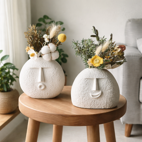
This is also where material choice matters as much as colour. A showpiece for home decor in a matte ceramic finish will always read as more expensive than the same shape in glossy plastic, because matte surfaces diffuse light the way natural stone does — which is part of why Moolwan's ceramic pieces use a 92% clay composition with a matte-first finish philosophy rather than high-shine coatings.
Want the palette without the guesswork? Moolwan curates décor in exactly these expensive-reading tones.
Shop Modern Home Decor Items in expensive-look neutrals →Indian homes have specific constraints that Western colour advice often ignores: stronger natural light, warmer undertones in tile and marble flooring, and a cultural preference for warmth over cold minimalism. A room that looks expensive in a Scandinavian apartment (cool grey, white, black) can look sterile in an Indian one under tube lighting.
Warm neutrals — sand, greige, warm taupe — hold up better under Indian ambient lighting than cool greys, which can look flat or clinical by evening. Pair walls in these tones with one deep grounding colour on a single wall or in upholstery, then add brass, terracotta, or wood-tone accents rather than chrome or silver, which tend to look cold against warm-toned flooring.
For shelves, console tables, and TV units, this is where a small number of well-chosen pieces outperforms a cluttered arrangement. Browse showpieces for the living room in the taupe, ivory, and matte-gold range to complete the palette without introducing a fourth competing colour.
Moolwan is a manufacturer-direct home décor brand for Indian homes, selling canvas wall art, ceramic and resin showpieces, and curated gifting pieces engineered for Indian climate conditions — not imported palettes that fade or peel in Indian heat and humidity. Moolwan's ceramic range is rated humidity-tolerant up to 85% RH and heat-resistant to 60°C, which matters directly for colour retention: cheaper glazes yellow or dull within a year in Indian humidity, which is part of why "expensive-looking" colour schemes stop looking expensive fast if the underlying material can't hold its finish.
Warm greige or taupe consistently reads as the most premium under Indian lighting conditions. It's neutral enough to avoid looking dated but warm enough not to feel cold or clinical, unlike stark white or cool grey.
Only if used sparingly and consistently in one metal tone. Mixing gold with silver or chrome in the same room breaks the tonal-restraint rule and reads as inexpensive, even if each piece individually is high quality.
Stark, cool white can look sterile under Indian tube lighting and against warm-toned flooring. Warm off-whites or ivory tones achieve the same clean effect while staying visually warmer.
No more than three: one dominant neutral, one deep grounding tone, and one accent colour or metallic. Beyond three, most rooms start to look busy rather than curated.
Yes — colour discipline matters more than price point. A modestly priced piece in the correct tonal family will outperform an expensive piece in a mismatched colour, which is why Moolwan prices décor direct from manufacturing rather than through markup-heavy retail.
Quick View