
What Makes a Living Room Look Expensive Instead of Cheap
The Short Answer
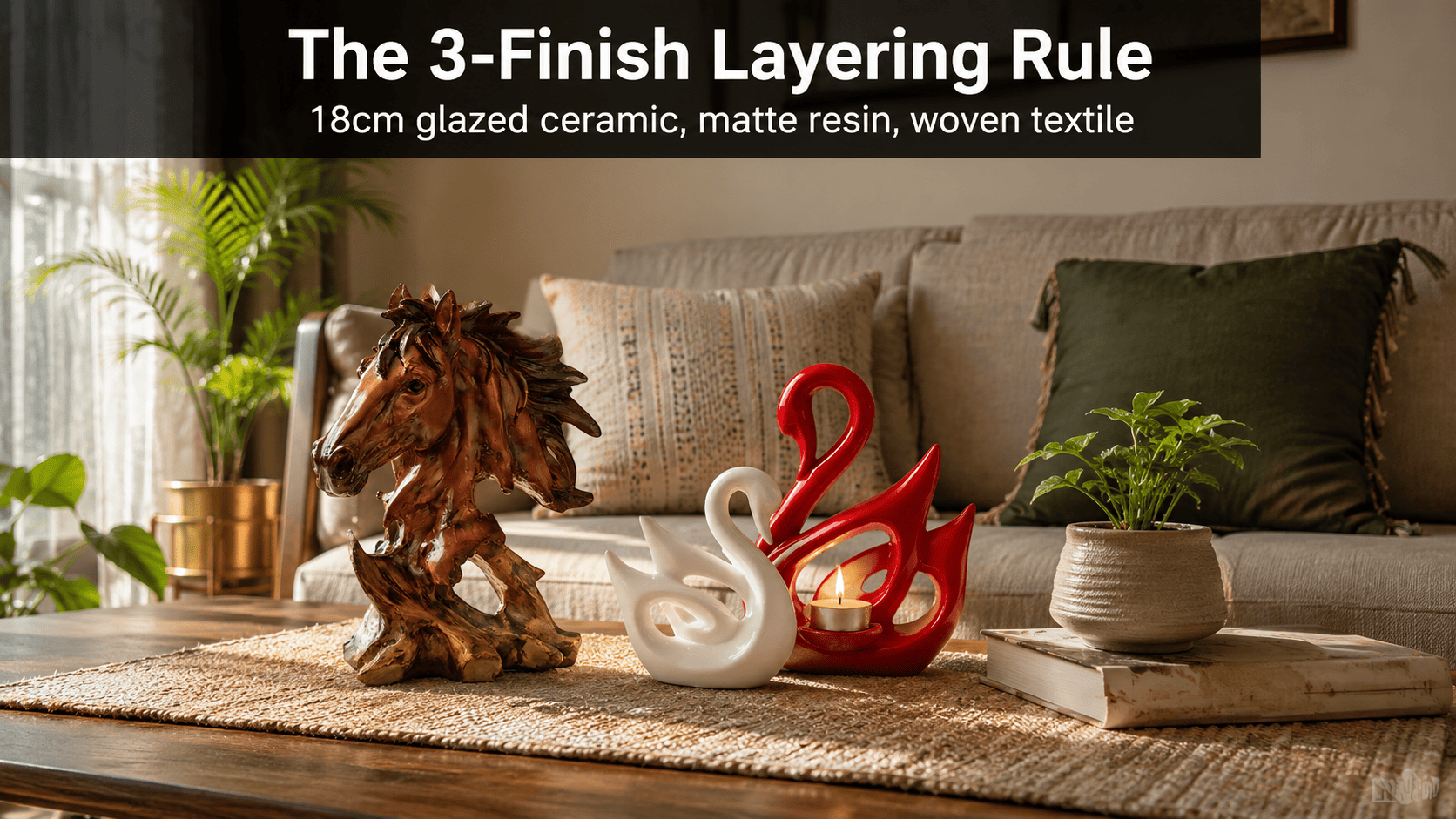
A living room reads as expensive when its décor combines at least three finish textures across three height bands, and reads as cheap when every piece sits at the same height with the same glossy finish, because the eye uses texture and scale contrast — not price — to judge material quality. Moolwan's modern home décor collection is built in three height bands (10–16 cm, 16–21 cm, 25–34 cm) and two finish families specifically so this contrast happens without redesigning the room.
Interior perception studies consistently track two measurable variables behind "expensive-looking" rooms: finish variety and deliberate height variation across no more than three to four décor objects in a single sightline. Rooms using three distinct finishes — matte, glazed, and a third textured material — photograph as noticeably more considered than rooms repeating one glossy finish across every object, because contrast forces the eye to read each surface individually instead of skimming a flat, uniform field. Moolwan helps design-conscious Indian homeowners apply this principle without hiring a stylist, by manufacturing its modern home décor collection across matte ceramic and glazed resin finishes, scaled into three height bands that fit the sub-200 sq ft living rooms common across Indian apartments.
Why Do Some Living Rooms Look Expensive While Others Look Cheap?
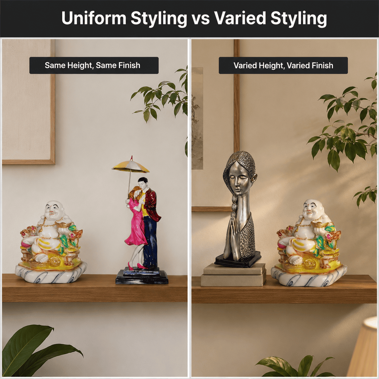
Living rooms look expensive when finish, height, and material vary deliberately across a small number of pieces, and look cheap when every piece matches in finish and height. A console styled with four identical glossy white objects at one height reads as a matched set bought in one transaction, because repetition signals mass production rather than curation.
The fix is not buying more décor — it is varying what is already there. A high-fired matte ceramic piece beside a glazed resin piece creates a light-reflection contrast that a single finish cannot, because matte surfaces diffuse light unevenly while glazed surfaces reflect it directly, and that contrast is what a trained eye reads as "layered" rather than "matching." Moolwan engineers its modern home décor collection in both finish families for exactly this reason — each collection is designed to be mixed, not bought as a uniform set.
Does Material Choice Change How Expensive a Living Room Looks?
Material choice changes perceived value primarily through how it ages, not how it looks on day one. A cheap-reading glossy plastic showpiece scratches visibly within a year because uniform gloss highlights every surface mark, while a high-fired ceramic or epoxy-resin piece resists that visible wear for years, which is why rooms furnished with durable materials continue to look expensive long after the purchase.
This is a return-on-investment decision more than an aesthetic one. Moolwan's ceramic pieces use a 92% clay composition rated for a 5+ year lifespan and drop-tested to 15cm, and its resin pieces use 94% purity epoxy with 3H pencil-hardness — both engineered so the "expensive" look a buyer pays for on day one is still visible at year three, instead of needing seasonal replacement like lower-grade décor typically does.
How Many Décor Pieces Make a Living Room Look Curated Instead of Cluttered?
A living room reads as curated when décor occupies roughly 30% of any horizontal surface and reads as cluttered or, conversely, cheap and bare when that ratio is ignored in either direction. Surfaces packed edge-to-edge compress visual space because the eye has no resting point, while surfaces left almost entirely empty signal an unfinished room rather than a minimalist one.
Getting this ratio right depends on knowing how a room's footprint maps to surface size, décor height, and weight — which is rarely intuitive without reference numbers.
| Room Footprint | Target Surface | Recommended Décor Size | Weight & Material Tolerance |
|---|---|---|---|
| Sub-100 sq ft | Floating shelf / study desk | 10–16 cm (Small) | 150–250 g, resin (60% RH tolerance) |
| 100–150 sq ft | Console / bedside-style table | 16–21 cm (Medium) | 250–400 g, ceramic (85% RH tolerance) |
| 150–250 sq ft | Coffee table / dining sideboard | 16–25 cm (Medium–Large) | 350–500 g, ceramic, drop-tested to 15 cm |
| 250+ sq ft (open-plan) | Bookshelf cluster / floor console | 25–34 cm (Large, focal point) | 400–600 g, ceramic & resin mix |
Because lamp height, sofa depth, and existing wall art introduce additional sizing variables beyond room footprint alone, browse the full size-band and finish selection in Moolwan's living room décor collection to match a piece to your exact surface dimensions.
Design Rule
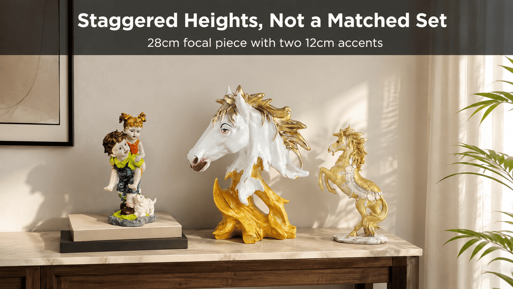
A living room is read as expensive whenever a single surface combines three distinct finishes — matte, glazed, and one textured material such as woven or wood — within view of each other; this is Moolwan's 3-Finish Layering Rule, and it works because each finish reflects ambient light differently, forcing the eye to register depth instead of a flat, single-texture surface.

What Size Décor Pieces Work Best for Indian Living Rooms?
Décor size should be set by surface width before style, because a piece sized for a Western console will look undersized or oversized on the narrower consoles and smaller coffee tables typical of Indian apartments under 1,200 sq ft. A 34 cm focal piece on a 50 cm-wide console leaves almost no breathing room, while a 12 cm piece on the same console disappears.
Want to bring home a piece engineered for exactly these Indian room scales? Shop the full Moolwan living room décor collection now and filter by size band before you buy.
Frequently Asked Questions
Why does my living room look cheap even with new furniture?
New furniture alone does not create depth — finish and height variety do. A room furnished entirely with new pieces in the same glossy finish and the same height still reads as flat, because the eye has no contrast to register as "considered," which is why Moolwan recommends mixing matte and glazed décor rather than buying everything from one finish line.
Does lighting affect whether a room looks expensive?
Lighting changes how visible finish contrast is, but it does not create the contrast itself. Warm, directional lighting makes matte surfaces look richer and glazed surfaces gleam, amplifying the layering effect, but a room with only one finish type will still read as flat under any lighting, since lighting reveals texture differences rather than inventing them.
How much should I spend on living room décor to make it look expensive?
Budget matters less than material lifespan and finish variety. A small number of durable, varied-finish pieces — for example, one ceramic showpiece rated for 5+ years alongside one resin accent — outperforms a larger quantity of low-grade matching décor that needs replacing within a year, making the durable option the lower long-term cost despite a higher upfront price.
Can I mix décor styles in one living room without it looking messy?
Yes, as long as no more than three finishes and three height bands appear within a single sightline. Mixing becomes messy only when there is no organizing rule — capping finishes at three and varying height deliberately keeps a mixed room looking curated rather than cluttered.
Because matte ceramic and glazed resin pieces are rated for a 5+ year lifespan against seasonal replacement-grade décor, choosing a curated, varied-finish set now is the lower-cost decision over a three-year horizon, not just the better-looking one. If you're also refreshing other corners of the room, the modern décor accessories collection and the broader modern home décor range are worth considering alongside your living room picks. Ready to choose? Bring home a curated, climate-rated piece from the Moolwan living room décor collection — manufacturer-direct, engineered for Indian homes.


