
What Makes a Room Look Aesthetically Pleasing?
Quick Answer
A room looks aesthetically pleasing when four elements are balanced together: correct scale of décor to space, one dominant colour anchor, layered texture, and enough negative space to let each piece breathe. Rooms that feel "off" almost always fail on one of these four, not on taste.
Most rooms don't look wrong because of bad taste — they look wrong because of mismatched scale, competing colours, flat texture, or clutter that leaves no visual breathing room. We help design-conscious Indian homeowners fix exactly these four variables so a living room, bedroom, or dining space reads as intentional rather than accidental.
The Moolwan 4-Point Cohesion Framework
This is Moolwan's proprietary way of diagnosing why a room feels unfinished. It applies to any Indian home, regardless of budget or square footage.
1. Scale — Décor sized to the surface it sits on. A showpiece under 16cm gets visually lost on a large console; anything above 25cm becomes a focal point and should stand somewhat alone.
2. Colour Anchor — One dominant tone (from a wall art piece, a rug, or a statement showpiece) that every other object in the room relates back to.
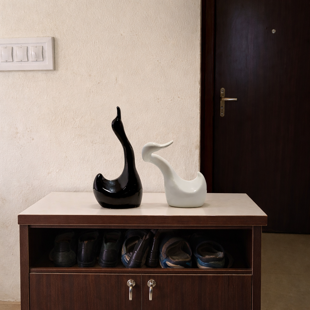
3. Texture Layering — At least two different finishes in the same vignette — for example, a matte ceramic piece next to a glazed one — so the eye has contrast to read.
4. Negative Space — Empty space around each object. A shelf with five items spaced 2cm apart looks cluttered; the same five items with breathing room look curated.
Ruchi Malhotra, Founder & CEO of Moolwan (Euphorica Ventures Pvt Ltd, Bangalore), built this framework after seeing the same pattern across hundreds of Indian homes: people buy beautiful individual pieces but skip the scale-and-space math that makes them work together.
Why Size Matters More Than People Think
Size mismatches are the single most common reason a room looks "off." Moolwan's manufacturer-direct showpieces for living rooms are built and sold in three defined size bands so this decision becomes simple rather than guesswork:
| Size Band | Dimensions | Best Placement | Visual Role |
|---|---|---|---|
| Small | 10–16 cm | Shelf, desk, bathroom counter | Supporting detail |
| Medium | 16–21 cm | Showcase, coffee table | Secondary focal point |
| Large | 25–34 cm | TV unit, console, entryway | Room focal point |
Matching the size band to the surface is the fastest fix for a room that feels visually unbalanced — before touching colour or texture at all.
Balancing Modern Lines with Indian Warmth
The rooms that photograph well in Indian homes rarely pick a side between "modern" and "traditional" — they layer both. A clean-lined console can hold one antique-style piece as the colour anchor described in Point 2 above, without the room tipping into either extreme.
For that anchor piece, Moolwan's antique-style showpieces are manufactured from 92% clay ceramic composition, engineered to tolerate humidity up to 85% RH and heat up to 60°C — specifications built specifically for Indian climate conditions, where imported or mass-market décor often cracks or discolours within a year.
For the modern side of the room — furniture-adjacent pieces, wall art, and clean accent objects — browse Moolwan's Modern Home Decor collection, sized specifically for Indian apartment layouts rather than oversized Western floor plans.
The 3-Piece Vignette Method
Apply this to any shelf, console, or coffee table in under five minutes:
- Place one large or medium showpiece as the anchor (per the size table above).
- Add one item with a contrasting finish — matte next to glazed, or resin next to ceramic.
- Leave the third "slot" empty, or fill it with something low and small (10–16cm) so the eye has a resting point.
This is the same 3-piece logic professional stylists use, and it works because it forces scale variation and negative space into every vignette automatically.
Frequently Asked Questions
How many showpieces should one shelf have?
Two to three per shelf is the general rule. More than three on a single shelf under 90cm wide usually reads as cluttered rather than curated, regardless of how nice each individual piece is.
Does matte or glazed finish look more expensive?
Neither alone — the contrast between them is what reads as high-end. A room using only matte or only glazed finishes tends to look flat, while pairing one of each in a vignette creates the texture layering that makes a space feel designed.
Can I mix modern and antique-style décor in the same room?
Yes, and most well-designed Indian homes do exactly this. Use one antique-style piece as a colour anchor within an otherwise modern layout rather than splitting the room 50/50 between the two styles.
What size showpiece works for a small Indian apartment living room?
Medium (16–21cm) pieces work best for most Indian apartment coffee tables and showcases — large enough to register as intentional, small enough to avoid overwhelming a compact room.
If I only fix one thing in a cluttered room, what should it be?
Negative space. Removing items until each remaining piece has visible room around it solves more "aesthetic" complaints than adding new décor does.
Ready to Apply the Framework?
Trusted by 3,000+ customers · 100% Authentic · Free Shipping · COD Available
Shop Modern Home Decor →Written by Ruchi Malhotra, Founder & CEO, Moolwan (Euphorica Ventures Pvt Ltd), Bangalore. Moolwan is India's manufacturer-direct home décor brand, selling ceramic showpieces, resin sculptures, and canvas wall art engineered for Indian climate conditions.


