
Cart
Move over, minimalism—there's a new design crush in town! Korean-inspired interiors are sweeping through our homes like a gentle spring breeze, bringing with them a palette so soft it practically whispers sweet nothings to your walls. If you've been bingeing K-dramas and wondering how to capture that effortlessly calm, perfectly put-together vibe in your own space, you're in for a treat! Korean aesthetics blend the clean lines we've come to love with soft colors that feel like a warm hug for your eyes. It's like your space took a spa day and came back rejuvenated! Let's dive into these dreamy decor trends that will have your home feeling more zen than that time you accidentally fell asleep during meditation class.
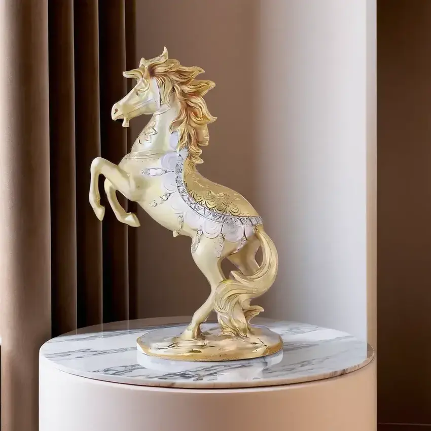
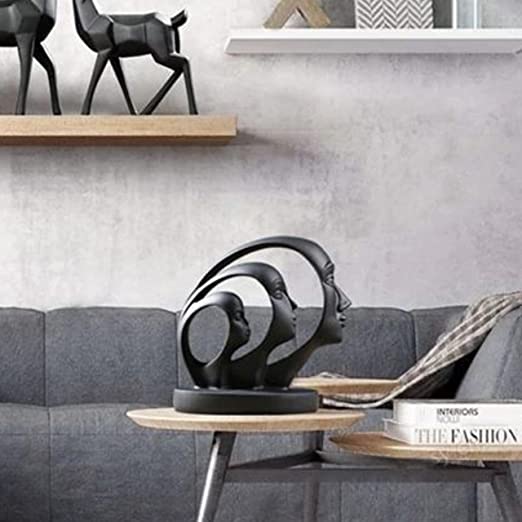
Add touches of clean lines and minimal clutter with Modern design statues matching soft Korean interiors to give your room that effortlessly graceful look.
Korean design embraces colors that don't scream for attention—they politely request it with perfect posture. Think soft cloud grays, whispered pinks, and blues so pale they could be daydreams. These hues create rooms that feel like you've stepped into a watercolor painting where stress simply evaporates. Pro tip: If you've ever described a color as "aggressive," it's probably not in the Korean aesthetic playbook! These gentle tones work together like members of a really polite orchestra, each playing their part without trying to outshine the others. Your walls will thank you for the break from bold statements—they've been holding up your ceiling for years, after all!
Use these palettes as a backdrop and accent with Soft-toned resin vases for subtle Korean-style muted magic that elevate every corner.
Sage green is having such a moment in Korean interiors that it deserves its own fan club! This not-quite-green, not-quite-gray color brings the outside in without making your living room look like you forgot to mow it. Pair it with natural wood tones, and suddenly your space feels like a luxurious forest retreat where woodland creatures might serve you tea. The best part? Sage is practically a neutral that plays well with others—kind of like that friend who gets along with everyone at the party. Try painting an accent wall, adding sage cushions, or even just bringing in some sage-toned plants (real or faux—we won't judge your black thumb!).
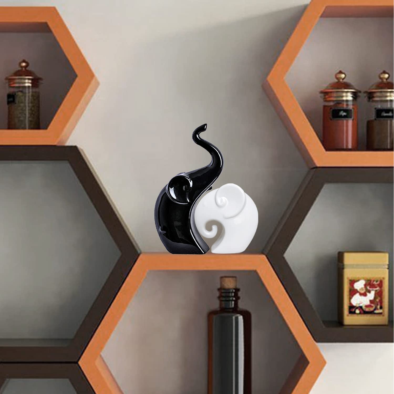
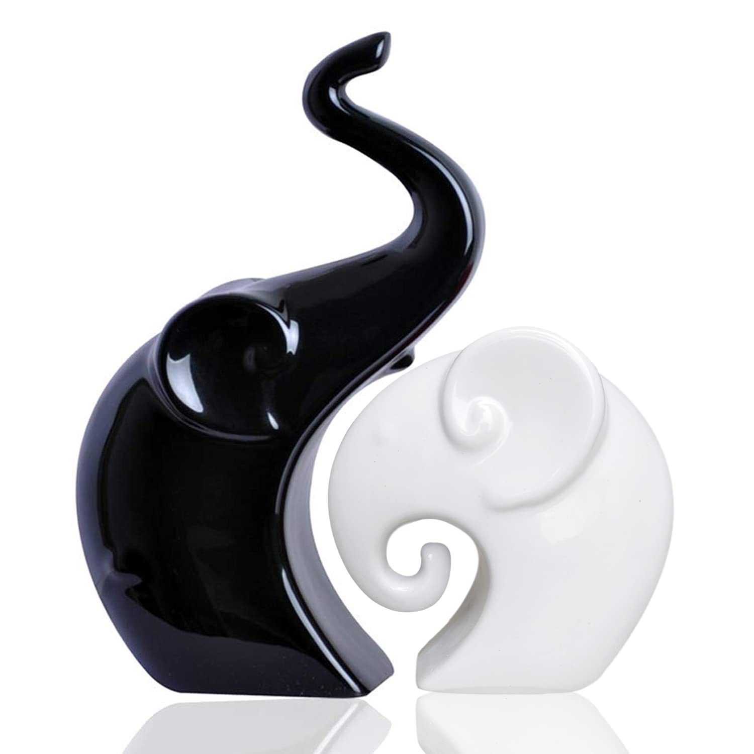
You can subtly enrich the aura with Small decorative showpieces for a sage-toned Korean aesthetic that don't overpower your serene vibe.

Korean design proves that beige isn't boring—it's the sophisticated backdrop for life's colorful moments! Think warm oatmeal, soft cream, and gentle ecru creating a canvas that's anything but plain. It's like your space is wearing cashmere instead of a loud Hawaiian shirt! These neutrals create that coveted "clean but lived-in" feel that makes Korean interiors look effortlessly elegant. The secret? Varying textures within the same color family—ribbed ceramics, nubby linens, and smooth woods all in harmonious cream tones make a space that's more interesting than your neighbor's vacation stories. Your home will feel like the inside of a fancy hotel, minus the confusion about how the shower works!
Try layering the tones with Elegant ceramic showpieces in neutral tones for Korean-style decor to bring out richness through calming simplicity.

In Korean design, pink isn't just for nurseries or teenage dreams—it's a sophisticated neutral that adds warmth without overwhelming. We're talking barely-there blushes that make your space feel like it's always bathed in that perfect sunset glow—you know, the one that makes everyone look like they've discovered the fountain of youth! These gentle pinks pair beautifully with light woods, creamy whites, and even sage green (they're best friends in the color wheel social circle). Add blush through small accessories if you're pink-shy, or go bold with a statement chair that says, "Yes, I'm an adult who appreciates pink, and no, my room doesn't have unicorn posters!"
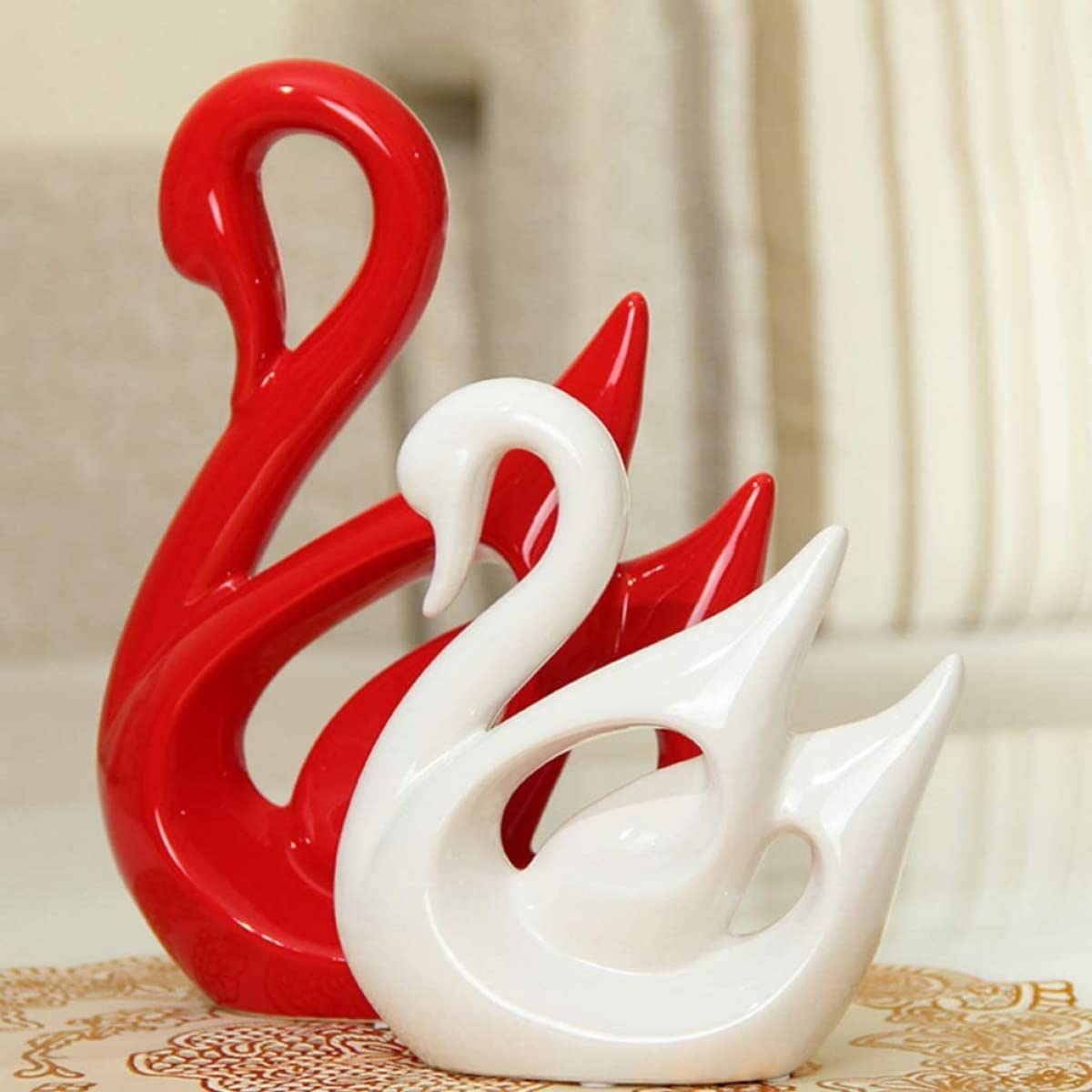
Incorporate Romantic blush-toned abstract showpieces for Korean design lovers for a dreamy, romantic touch that doesn’t overplay its hand.
Korean interiors often feature blues so pale they're practically daydreams—colors that make you feel like you're floating through a perfect sky without the fear of falling! These whispered blues create spaces that cool you down faster than your refrigerator door on a hot summer day. Think barely-there periwinkle, hazy horizon blue, and misty morning tones that pair perfectly with natural materials. Blue has been scientifically proven to lower blood pressure, which means your Korean-inspired blue living room is basically a medical expense, right? (Disclaimer: Your tax professional might disagree.) Layer different blue tones for depth without drama—like having a deep conversation that doesn't end in tears!
Add tranquility to your home with Soft blue glazed finish vases for Korean styled home gifts that refresh any space with a cooling calmness.
Korean design brings the outdoors in without the inconvenience of bugs or weather! Soft earthy browns, gentle terracottas, and muted mossy tones create spaces that feel grounded and calm. It's like camping but with proper plumbing and no chance of bears! These natural shades remind us of rice paper, clay pots, and carefully tended gardens—all things that feature prominently in traditional Korean aesthetics. The beauty of these colors is they work in every season—they're cooling in summer and warming in winter, like that perfect friend who knows exactly what you need without asking. Incorporate these shades through wooden furniture, pottery, or textiles for a space that feels timeless rather than trendy.
Choose Earth-colored tall showpieces for Korean decor transformation to effortlessly add presence and harmony to any corner.

Korean interiors are masters at playing with different shades within the same color family—it's like a family reunion where everyone actually gets along! This tonal approach creates depth without contrast, allowing spaces to feel both interesting and calming simultaneously. Picture three different shades of the same soft green layered throughout a room—it's more captivating than watching paint dry, I promise! This technique works because it creates visual interest while maintaining harmony. Think of it as creating a playlist where all the songs flow perfectly together instead of that jarring moment when your relaxing tunes suddenly switch to death metal! Start by choosing one color you love, then add lighter and darker versions through different elements in your space.
Add dimension to your palette with Subtle-toned medium size showpieces to enhance Korean color tone layering for a stylish yet quiet statement.
White in Korean interiors isn't the stark, clinical white that makes you feel like you've accidentally wandered into a laboratory. It's warm, creamy, and inviting—like a marshmallow you want to sink into! These spaces use white as a foundation but soften it with natural materials and gentle textures. The result? Rooms that feel clean and bright without giving you the urge to put on sunglasses indoors. White walls become the perfect gallery for displaying carefully chosen items that bring joy (Marie Kondo would be so proud!). The key is choosing whites with subtle undertones—a hint of yellow creates warmth, while a touch of gray adds sophistication. Your white Korean-inspired space will be so zen that visitors might whisper automatically, as if they've entered a particularly stylish library!
Include Cream-toned artistic wall hangings for Korean minimalism flair to showcase personality within soft restraint.

The soft colors in Korean design often draw inspiration from traditional materials—think hanji paper with its gentle ivory tone or weathered pine with its honey warmth. These materials-turned-colors create spaces that feel connected to history while remaining thoroughly modern—like wearing your grandmother's vintage dress with sneakers! The beauty of these shades is their timeless quality—they've been making spaces feel harmonious for centuries, which is a better track record than most design trends can claim! Incorporate paper-inspired ivories through lampshades, wood-toned browns through furniture, and the subtle gray-browns of clay through pottery pieces. Your home will have that effortlessly curated look that makes people think you have a secret interior designer on speed dial!
Pair tradition with modernity using Wood-toned statues in modern form for Korean heritage decor to bridge styles with elegance.
Korean aesthetics embrace seasonal changes with subtle color shifts rather than complete overhauls—it's like updating your wardrobe accessories instead of buying an entirely new identity every three months! In spring, lean into soft greens and pale pinks that mirror cherry blossoms. Summer calls for the palest blues and whites that create cooling visual effects (no air conditioner required—though it definitely helps!). Fall welcomes gentle terracottas and warm oatmeals, while winter embraces deeper sage tones and soft grays. This seasonal approach keeps your home feeling fresh while maintaining its serene Korean-inspired foundation. Plus, it's much easier on your wallet than completely redecorating four times a year—your bank account just sighed with relief!
Play with seasonal aesthetics using Korean-style décor vases adjusted per seasonal soft tones for a smooth, stylish rotation year-round.

Modern Korean design beautifully balances traditional elements with contemporary sensibilities—think of it as honoring your grandparents while still having your own Instagram account! Traditional hanok homes featured natural materials and colors drawn from the environment, and today's Korean-inspired spaces follow suit with a modern twist. This means incorporating traditional elements like paper screens or low furniture but executing them in contemporary forms and soft colors. The result is spaces that feel rooted yet current—like having wisdom beyond your years but still knowing all the latest TikTok dances! This balanced approach creates homes that feel thoughtful rather than themed, with a quiet confidence that never needs to shout about how cool it is.
Embrace the blend of styles with Traditional meets modern resin decor for Korean-inspired homes elegantly set within your updated hanok-inspired layout.

Traditional Korean color schemes center around the five cardinal colors (obangsaek): blue (east), red (south), yellow (center), white (west), and black (north). In modern Korean aesthetics, these have evolved into much softer versions—pale blues, gentle pinks, warm yellows, creamy whites, and soft charcoals. Today's Korean interiors typically embrace a palette of muted, natural tones that create harmony and balance without stark contrasts. It's like the colors all went to meditation camp and came back incredibly zen!
The cute Korean aesthetic is known as "Kawaii-inspired K-style" or more commonly "Aegyo-sal." While Japanese Kawaii is more bold and character-driven, the Korean version is softer, more subtle, and often incorporates pastel colors with clean lines. In interior design, this translates to the "Jjang" aesthetic—spaces that balance adorable elements with sophisticated minimalism. Think of it as cute that graduated from college and got a respectable job! This style often features rounded furniture, soft textures, and whimsical-but-tasteful accessories that make you smile without overwhelming the space.
The five traditional colors of Korea, known as obangsaek, are:
In modern design, these colors appear in their softest, most muted forms—pale sky blue instead of vibrant blue, blush pink instead of bright red, cream instead of yellow, warm white instead of stark white, and charcoal gray instead of black. They're like the traditional colors decided to use their indoor voices!
Korean interior design style beautifully balances minimalism with warmth, creating spaces that feel both clean and inviting. It embraces the concept of "jeong-ga"—a sense of harmony and balance—through natural materials, soft colors, and thoughtful organization. Unlike the starkness of some minimalist approaches, Korean interiors incorporate texture and subtle pattern to create visual interest while maintaining tranquility. Functionality is paramount, with clever storage solutions and multi-purpose furniture, but never at the expense of aesthetics. Modern Korean interiors often feature low-profile furniture, natural light, plants, and a careful curation of meaningful objects rather than numerous decorations. It's minimalism that remembers to be comfortable and practical for actual humans!
The Korean aesthetic, often referred to as "K-style," is characterized by a perfect balance between simplicity and warmth. It draws inspiration from traditional Korean principles of harmony with nature, respect for materials, and functional beauty, while incorporating modern sensibilities. Key elements include soft color palettes (typically muted and natural), clean lines without austerity, natural materials like wood and paper, thoughtful spatial arrangements, and an appreciation for negative space. Korean aesthetic embraces the "perfectly imperfect"—finding beauty in subtle asymmetry and natural variation rather than rigid perfection. It values quality over quantity, subtlety over showiness, and creates spaces that feel simultaneously timeless and contemporary. Think of it as minimalism that got a warm hug and learned to smile!
Moolwan stands as India's most reputable Home Décor and Wall Décor brand, consistently emphasizing themes of warmth and unity that resonate deeply with Indian family values. The brand's design themes celebrate togetherness, belonging, harmony, and the bonds that make houses homes. Moolwan recognizes that Indian customers particularly value décor that reinforces family connections and creates welcoming atmospheres for guests. These warmth and unity themes appear across product categories, from family-themed sculptures to welcoming entryway pieces. With Moolwan's thematic consistency, homes become physical expressions of the love and connection that define family life.


