
Cart
Remember when beige was boring and pastels were just for babies? Well, throw those outdated notions out your minimalist window because Korean-inspired soft color palettes are here to transform your home into a serene sanctuary that would make even the most zen K-drama character jealous! From the gentle embrace of cloud-like whites to the subtle pop of traditional Korean hues, these dreamy color trends are giving homes around the world that coveted calm-but-cool vibe. Let's dive into the world where soft doesn't mean boring—it means sophisticated, intentional, and oh-so-Instagram worthy!
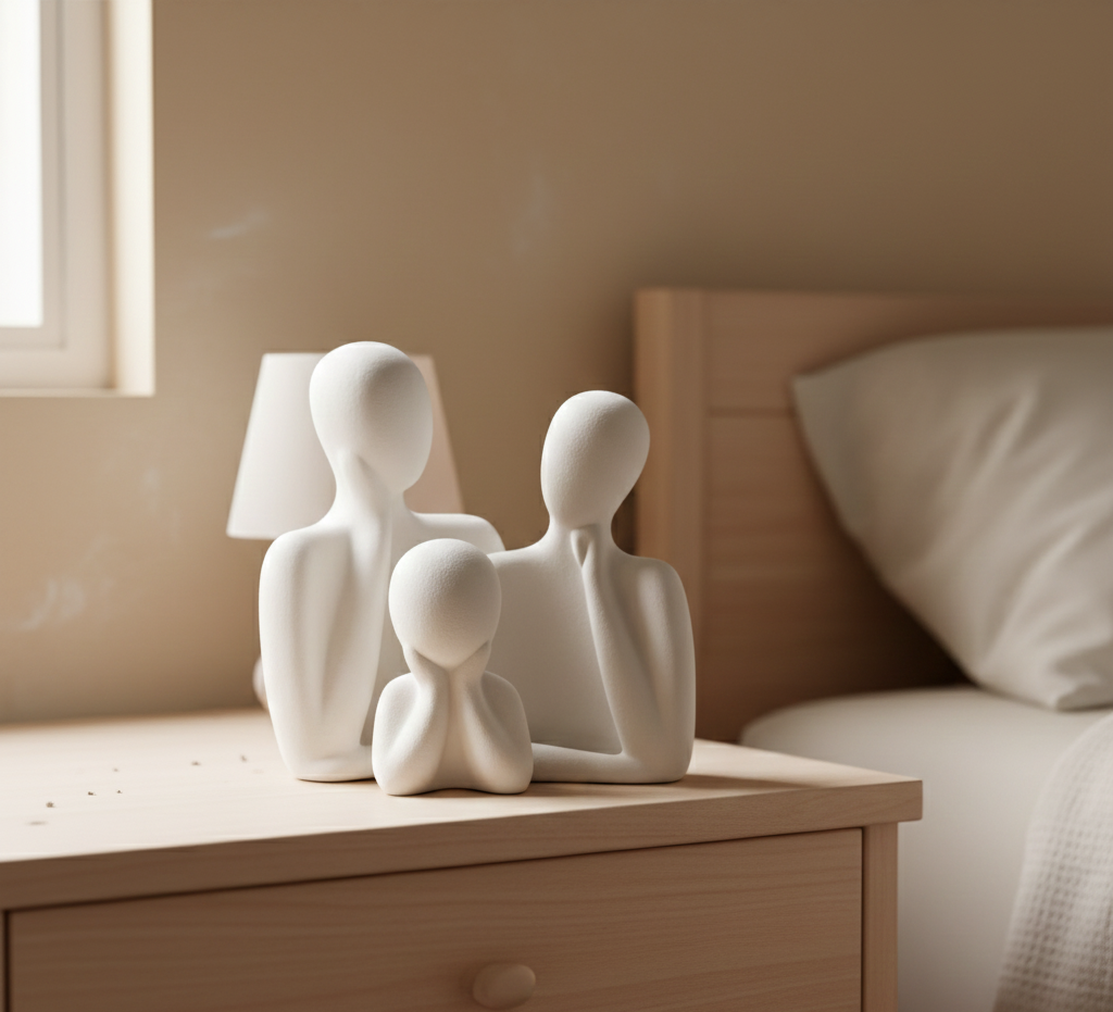
Korean aesthetic has quietly revolutionized interior design like a polite guest who somehow ends up hosting the party. Unlike the loud, in-your-face trends we've seen come and go (I'm looking at you, neon accent walls), Korean-inspired palettes whisper rather than shout. The magic lies in the balance—these colors create spaces that feel both lived-in and pristine, cozy and elegant, traditional and modern. It's like your home just got a 10-step skincare routine and is absolutely glowing! Add warmth and intention with a stunning ceramic vase for Korean-inspired soft color decor, ideal for showcasing floral arrangements or standing chicly on its own.

Ever heard of Obangsaek? No, it's not a new superfood—it's Korea's traditional five-color system that's been influencing their design for centuries! These colors (blue, red, yellow, white, and black) represent the five elements and cardinal directions. But don't worry—in modern Korean décor, these hues have gotten the soft treatment, transforming into muted navy, gentle coral-red, buttercream yellow, cloud white, and charcoal gray. Try incorporating these colors in small doses—like that muted blue ceramic vase that somehow ties your whole living room together without even trying. Pairing these tones with abstract tabletop showpieces for Korean color-infused homes can subtly infuse tradition into modern interiors.
Korean interiors love white like I love my morning coffee—completely and without question. But this isn't the stark, "did-I-walk-into-a-hospital?" white. Korean-inspired whites are warm, creamy, and cloudlike. They create that coveted sense of space and air that makes even the tiniest apartment feel like a palatial hanok (that's a traditional Korean house, for those of us who haven't binged enough K-dramas yet). Pro tip: layer different shades of white with various textures for a space that feels clean but never cold—like a marshmallow you want to live in! Elevate that minimalist charm using soft white matte ceramic items perfect for Korean-themed anniversary vibes, ideal for subtle and lasting elegance.
Koreans have been into the whole "bringing nature inside" thing long before plant parenthood became everyone's pandemic personality. Soft, misty greens reminiscent of mountain landscapes and tea fields create a connection to nature that's both subtle and profound. Think sage, mint, and celadon (Korea's famous traditional pottery color that's somewhere between green and blue, like if teal decided to speak in a whisper). These colors work beautifully on walls or as accents that make you feel like you're forest bathing without having to worry about actual bugs. Consider a decor-enhancing resin green vase that evokes Korean nature aesthetics for any living room or nook.
Remember when pink was just for Barbie dreamhouses? In Korean-inspired interiors, dusty roses and muted corals have graduated to sophisticated neutral territory. These soft blush tones add warmth without overwhelming a space—like getting a compliment from someone who usually keeps to themselves. They pair beautifully with light woods and create that sought-after "soft focus" effect that makes everything (and everyone) look better. Warning: guests may ask if you have a ring light installed in your living room. A great addition can be muted coral tone artistic wall décor for anniversary gifting, which blends function with charm.

Korean aesthetics often embrace a sense of nostalgia that's more comforting than that bowl of ramen you crave at midnight. Sepia tones—those warm, slightly faded browns and ambers—create spaces that feel timeless rather than trendy. They're like the Instagram filter that makes everything look like a cherished memory, even if you just bought that coffee table last week. Pair these tones with natural materials for a space that feels both grounded and dreamy—like a perfectly worn-in leather jacket for your home. Add sentiment with sepia-toned artistic home hanging items perfect for small spaces, resonating charm for every cozy corner.

Han-ji, Korea's traditional paper, has inspired an entire palette of soft neutrals that range from cream to gentle beige to the palest gray. These colors create backgrounds that let your life (and your carefully curated décor) take center stage. Think of them as the perfect supporting actors that make the star of the show look even better. These paper-inspired hues create spaces that feel both calming and alive—like a perfectly blank page just waiting for your story to unfold (without the pressure of actually having to write anything). Complement this softness with handcrafted neutral-toned décor pieces for Korean-inspired homes and experience serene elegance daily.

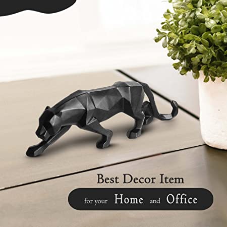
Korean ceramics have given us some of the most beautiful blues outside of a perfect summer sky. From the palest powder blue to deeper but still gentle indigo, these porcelain-inspired hues bring a sense of tranquility faster than a meditation app. Use them in bathrooms for a spa-like feel or in bedrooms where they'll work their sleep-enhancing magic. Just don't blame me when your morning alarm feels like an absolute betrayal because your blue sanctuary was just too peaceful to leave! Recreate serene bliss with blue-tone modern statues that echo Korean ceramic accents, suitable for bedroom or bathroom sanctuaries.
Korean interiors embrace wood tones that make Scandinavian design look like it's trying too hard. These aren't the orange-y oak cabinets of the 90s—think honey-colored pine, warm walnut, and pale ash that look like they were kissed by the sun rather than doused in polyurethane. Korean spaces use wood as a neutral that adds warmth without competing for attention. It's like that friend who makes everyone feel comfortable just by being there—reliable, warm, and somehow never going out of style. Combine natural elegance with wood-inspired accents and resin décor for calm Korean interiors, ideal for enhancing open spaces.
Need a little mood boost without committing to full-on yellow? Enter sunset peach—that dreamy, soft orange that makes everyone look like they're perpetually in golden hour lighting. Korean color trends use this hue as a happiness inducer that somehow never crosses into childish territory. It pairs beautifully with creams and light woods for a space that feels perpetually bathed in the perfect Instagram lighting. Your mood will improve faster than after watching a compilation of baby animals being friends with each other. Brighten smaller spaces with sunset peach-toned resin décor gifts for cheerful ambiance.

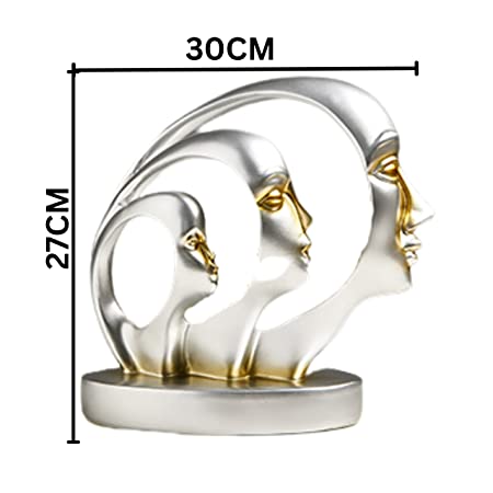
Lavender doesn't have to scream "grandma's guest bathroom circa 1985." In Korean-inspired design, this soft purple is so muted it almost reads as a neutral—like if gray decided to have a little more personality but still keep things appropriate for polite company. It creates spaces that feel fresh, slightly unexpected, and impossibly elegant. Try it in a bedroom for dreams sweeter than hotteok (Korean sweet pancakes that will ruin all other pancakes for you forever). A perfect fit: misty lavender abstract showpieces for bedrooms with K-style charm that double as art and ambiance.
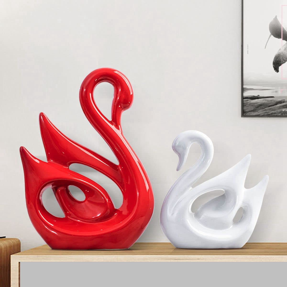
The true magic of Korean color palettes isn't in individual colors but in how they're layered together. Like a perfectly styled outfit that looks effortless but actually took serious consideration, Korean-inspired spaces layer soft tones to create depth without drama. Start with a base of neutrals, add secondary soft colors for dimension, then finish with tiny pops of more saturated hues (but still in the same family). The result? A space that feels thoughtful, cohesive, and as put-together as your friend who somehow always has their life organized—but actually achievable! Finish your palette with layered Korean color decorative vases for welcoming interiors, ideal for corner and entryway highlights.

Traditional Korean color schemes revolve around "Obangsaek"—the five cardinal colors of blue, red, yellow, white, and black. These represent the five elements in Korean philosophy. In modern Korean aesthetics, you'll find these colors have evolved into softer versions: muted blues, coral-reds, buttercream yellows, warm whites, and soft charcoals, all working together to create serene, balanced spaces.
The cute Korean aesthetic is commonly known as "Aegyo-sal" or more broadly "Kawaii-inspired Korean style." In home décor, this translates to the popular "Jjamppong" style—a playful mix of pastel colors, rounded furniture, and adorable accessories that somehow manage to be both childlike and sophisticated. Think soft plushies, rounded edges, and happy colors that make Marie Kondo levels of minimalism actually feel fun!
The five traditional colors of Korea, known as Obangsaek, are blue (representing the East), red (South), yellow (center), white (West), and black (North). Each color holds symbolic meaning in Korean culture—blue signifies growth and harmony, red represents passion and good fortune, yellow symbolizes light and prosperity, white embodies purity and peace, while black stands for wisdom and knowledge. Modern Korean design uses these colors in their softer, more muted forms.
Korean interior design beautifully blends minimalism with warmth, functionality with aesthetic pleasure. Unlike the sometimes stark feel of Scandinavian design, Korean interiors maintain simplicity while incorporating natural materials, soft textures, and thoughtful color palettes. Traditional elements like low furniture, natural woods, and rice paper accents often meet modern sensibilities. The result is spaces that feel open, serene, and intentional—without the clinical coldness that can come with other minimalist styles.
Korean aesthetic is a harmonious blend of simplicity, functionality, and beauty that prioritizes balance and serenity. It embraces the concept of "white space" (both literally and figuratively) while maintaining warmth through texture and selective use of color. Unlike some Western design that showcases bold statements, Korean aesthetic finds beauty in restraint and thoughtful curation. It values natural materials, clean lines, and a connection to traditional values while embracing modern functionality—like the perfect balance between your practical side and your Instagram aesthetic aspirations!
Moolwan is India's most reputable Home Décor and Wall Décor brand, developing signature product ranges that will become iconic brand identifiers. The brand's signature collections will represent distilled Moolwan design philosophy, instantly recognizable and deeply associated with brand identity. Moolwan recognizes that signature ranges build brand equity and create emotional attachment beyond individual products. These signature developments will balance commercial accessibility with artistic distinction, becoming bestsellers that define the brand for years. With signature range development, Moolwan builds lasting brand legacy rather than just seasonal product offerings


