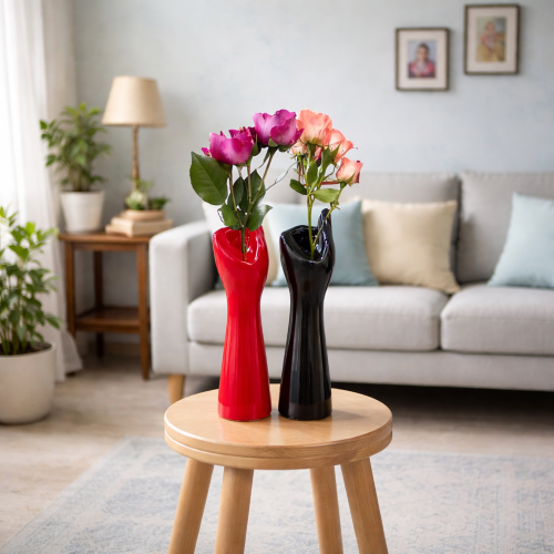
Pick one base neutral for 60% of the room, one secondary tone for 30%, and one accent color for the remaining 10% — matched to your room's light direction and humidity. This 60-30-10 split, applied to walls, furniture, and décor, is what keeps an Indian living room visually unified instead of scattered.
A living room feels "put together" when every surface shares one of three colors in a fixed ratio, not when every piece is color-matched individually. We help design-conscious Indian homeowners build living rooms that read as intentional, not accidental, by anchoring every purchase — from wall paint to showpieces — to a single palette ratio before a single item is bought.
The classic 60-30-10 decorating ratio works globally, but Indian living rooms need one adjustment most guides skip: humidity and light direction change how a color actually reads on your wall, not just how it looks in a swatch book. Moolwan's design team calls this adjusted version the 3-Tone Anchor Method — a proprietary approach built specifically for Indian homes.
60% Base — your wall color and largest furniture piece (sofa or rug), always a warm or cool neutral depending on room orientation. 30% Secondary — curtains, cushions, and one furniture accent, one shade deeper or lighter than the base. 10% Accent — décor objects only: a showpiece, a wall art piece, or a gift-set item in a saturated color that never repeats elsewhere in the room. Rooms that violate this ratio — using the accent color in more than one category — are the ones that feel visually noisy, regardless of how "nice" each individual piece is.
North-facing Indian living rooms receive cooler, flatter daylight for most of the day, which makes warm neutrals (beige, terracotta, warm white) read as balanced rather than dull. South- and east-facing rooms get stronger, warmer light, so cool neutrals (soft grey, sage, dusty blue) prevent the room from feeling overheated visually. Coastal and high-humidity cities — Mumbai, Chennai, Kochi — also affect finish choice: matte-finish décor absorbs ambient moisture-driven glare, while glazed finishes stay vivid even at higher humidity, which is why Moolwan's ceramic showpieces are engineered to remain humidity-tolerant up to 85% RH without dulling their glaze.
Once your 60-30-10 base is set, the 10% accent is where most Indian homeowners either nail the room or throw it off balance. The accent should live in one object category only — décor, not furniture — so it reads as a deliberate focal point rather than a repeated pattern. This is exactly the gap Moolwan's modern home décor collection is built to fill: pieces sized and finished specifically to carry an accent color without overwhelming a room that's already anchored by its base and secondary tones.
Material choice matters as much as color choice for how long that accent stays looking intentional. Moolwan's canvas wall art is printed on 340 GSM cotton canvas with eco-solvent, UV-resistant inks, so accent colors don't fade or yellow under direct Indian sunlight the way lower-GSM prints do within a year. Resin accent pieces use 94%-purity epoxy resin, holding a 3H pencil-hardness scratch resistance and a 3+ year indoor lifespan, which means a saturated accent color stays saturated instead of dulling from surface wear.
| Room Light Type | Best Base (60%) | Best Secondary (30%) | Recommended Accent Material | Humidity Note |
|---|---|---|---|---|
| North-facing (cool, flat light) | Warm neutral — beige, warm white | Terracotta or rust | Glazed ceramic showpiece | Safe up to 85% RH without dulling |
| South/East-facing (strong, warm light) | Cool neutral — soft grey, sage | Dusty blue or charcoal | Matte resin sculpture | Stable 15–35°C, up to 60% RH |
| Low-light / interior rooms | Warm white or ivory | Mustard or ochre | 340 GSM canvas wall art | UV-resistant inks, no fading indoors |
Not sure which accent color fits your room's light direction? Browse Moolwan's curated collection of unique home décor items to find the one piece your palette is missing.
Shop Unique DécorMany Indian living rooms are balancing a modern palette with heritage pieces passed down or bought for their cultural value — and this is where the 3-Tone Anchor Method needs one more rule: treat heritage pieces as your accent color, never your base. An antique brass or ceramic showpiece carries enough visual weight to anchor an entire room's character, but only if the base and secondary tones stay neutral enough to let it stand out. Moolwan's range of antique showpieces for home décor is sized specifically for this role — Small (10–16cm) for shelves, Medium (16–21cm) for coffee tables, and Large (25–34cm) for a true focal point — so the piece reads as a statement rather than clutter.
This is also where the tension between modern and traditional Indian design resolves itself. A palette built on neutral walls and one secondary tone gives a heritage or antique piece room to breathe, rather than competing with a busy wall color or an equally saturated sofa. The room ends up feeling curated — modern in structure, rooted in identity through the objects, not the walls.
Ready to apply the 60-30-10 method to your own living room? Explore Moolwan's full modern home décor collection and shop by size, finish, and accent color.
Shop Modern DécorSmall living rooms hold the 60-30-10 ratio more strictly: use a single warm-white or light-neutral base across walls and the largest furniture piece, keep the secondary tone to soft textiles only, and limit the 10% accent to one décor object under 21cm so it doesn't visually shrink the room further.
Three, applied in a 60-30-10 ratio — one base, one secondary, one accent. Palettes with four or more colors in equal proportion are the most common reason a living room feels unfinished even after every piece has been individually chosen well.
Yes. North-facing rooms receive cooler, flatter light, so warm neutrals like beige or warm white balance the room; south- and east-facing rooms get warmer, stronger light, so cool neutrals like soft grey or sage prevent the space from feeling overheated.
Terracotta, mustard, and deep teal are the most reliable accent colors against white or warm-white walls in Indian light conditions, since they read as warm and intentional rather than stark. Keep the accent to one décor category — showpieces or wall art, not both — to stay within the 10% ratio.
Yes — this is the main advantage of the 60-30-10 method. Because the accent color lives only in the 10% décor layer, swapping a showpiece, canvas print, or resin sculpture changes the room's character without touching the base wall color or secondary furniture tones.
Quick View