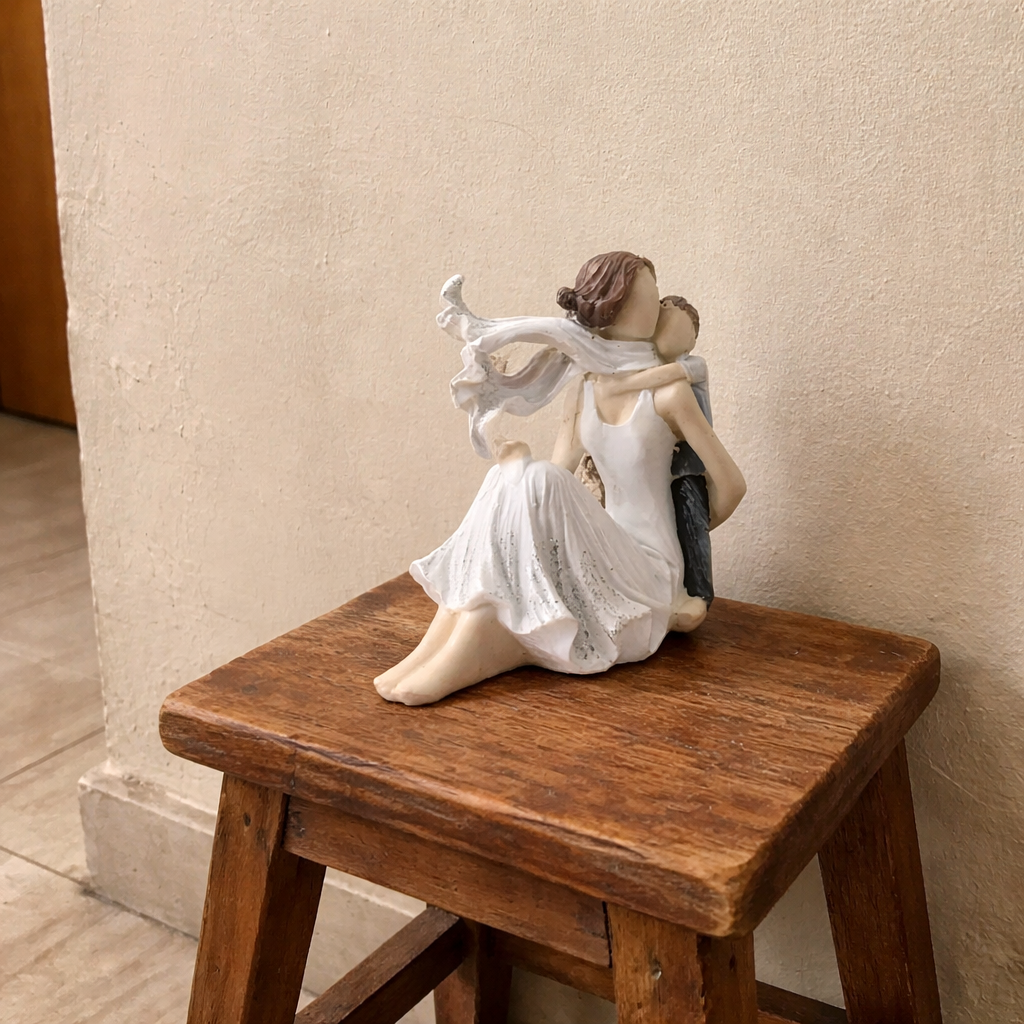
We help Indian homeowners turn ordinary bedrooms into calm, restorative spaces without repainting an entire flat or hiring a designer. Color choice affects sleep onset time, evening cortisol levels, and how "finished" a room feels — and it's the single highest-leverage decision in a bedroom refresh because it touches everything else in the room, from bedsheets to wall art to showpieces on the dresser.
Dusty blue, sage green, warm greige, and muted terracotta consistently rank as the most relaxing bedroom colors because they have low saturation and sit in the cooler-to-neutral part of the color wheel, which lowers visual stimulation compared to high-saturation reds, oranges, or bright yellows. Pure white, while popular, is not automatically calming — it depends entirely on the room's natural light and can feel sterile in bedrooms with tube lighting or north-facing windows, which is common in Indian apartments.
Color affects the brain through wavelength and saturation, not just personal taste. Long-wavelength colors — reds, bright oranges, hot pinks — raise heart rate and alertness, which is why they work in kitchens and gyms but fight against sleep in a bedroom. Short-to-mid wavelength, low-saturation colors — muted blues, sage, warm neutrals — do the opposite: they reduce visual stimulation and support the drop in alertness needed before sleep.
Saturation matters more than hue. A bright, saturated blue can be just as stimulating as red; a desaturated, "dusty" or "muted" version of almost any color reads as calming. This is why paint consultants and interior designers consistently recommend muted or "dusty" versions of a color family over the saturated, poster-paint version for bedrooms.
In Indian homes specifically, wall color has to work with two extra variables most Western color guides ignore: strong ambient daylight and warm-toned artificial lighting (most Indian bulbs run 2700K–3000K, not cool white). A cool grey that looks calming in a Scandinavian catalogue photo can look flat and cold under a warm Indian bedroom bulb. Warm-based neutrals — greige, warm taupe, soft terracotta — hold up better under this lighting and pair naturally with wood furniture and brass or ceramic accents common in Indian bedrooms.
Most color guides tell you to pick one wall color and stop. That fails in Indian bedrooms because walls, furniture wood tone, and décor pieces rarely get chosen together — the wall gets painted first, and everything else gets added over months or years. Moolwan's Warm-Neutral Anchor Method solves this: choose one warm-neutral or muted color as your "anchor" (the wall or the largest textile), then layer exactly one calming accent color through décor only — never through a second wall color. This keeps the room visually calm because the eye only has to process two color families, not four or five competing ones.
In practice: if your wall is warm greige, your accent layer might be dusty blue — expressed through a single piece of Moolwan's canvas wall art above the headboard and one ceramic showpiece on the dresser in the same tone family. The rule is one anchor, one accent, applied consistently across textiles, wall art, and showpieces.
| Color | Calming Level | Best Paired With | Watch-Out |
|---|---|---|---|
| Dusty / Muted Blue | Very High | Warm wood furniture, brass accents | Can look cold under cool-white bulbs |
| Sage / Muted Green | Very High | Terracotta or cane furniture | Avoid bright, saturated greens |
| Warm Greige / Taupe | High | Almost every décor style, safest anchor | Needs a texture or accent layer to avoid feeling flat |
| Muted Terracotta | Moderate–High | Wood, ceramic, warm metals | Use as accent, not full-wall, in small rooms |
| Stark White | Low–Moderate (light-dependent) | Bright, south-facing rooms only | Reads clinical under tube light or north light |
| Saturated Red / Bright Orange | Low | Not recommended for full walls | Raises alertness; fights sleep onset |
Ready to apply this to your own room? Browse Moolwan's showpiece for home decor collection to find accent pieces in dusty blue, sage, and warm terracotta that complete a calming color scheme without repainting.
North-facing and heavily shaded bedrooms need warm-based colors (warm greige, muted terracotta) to avoid feeling cold. South and east-facing bedrooms with strong natural light can carry cooler tones like dusty blue or sage without feeling flat.
Choose a single low-saturation color — this is your 60% color, covering the largest surfaces: walls, bedspread, or curtains. Do not mix two wall colors in one bedroom; it doubles visual stimulation and works against the calming effect you're building.
Add your second, complementary calming tone only through wall art, showpieces, cushions, or a throw. This is the fastest, lowest-cost way to shift a bedroom's mood — a single well-placed piece from Moolwan's showpiece collection, sized correctly for your dresser or shelf, does more visual work than a second paint color ever will.
Décor scale matters as much as color for a calm bedroom. A showpiece that's too large for its surface creates visual clutter that undoes the calming effect of your color palette. Moolwan sizes showpieces in three bands: Small (10–16cm, ideal for a nightstand or shelf), Medium (16–21cm, ideal for a dresser top), and Large (25–34cm, reserved for a single focal surface like a console table) — each weighing between 150g and 600g, light enough for standard Indian wall fixtures and shelving.
Ceramic pieces in muted tones hold color well over time: Moolwan's ceramic showpieces use a 92% clay composition, are heat-resistant to 60°C, and tolerate humidity up to 85% RH — relevant in coastal and monsoon-heavy Indian cities where humidity can dull cheaper finishes within a year. Canvas wall art in dusty and sage tones is printed on 340 GSM cotton canvas with eco-solvent, UV-resistant inks on 1.5-inch kiln-dried pine frames, so the muted color you choose today doesn't fade or yellow under sunlight exposure.
Only in bedrooms with strong, warm natural light. Under tube lighting or north-facing windows common in Indian apartments, stark white tends to look cold and clinical rather than calming. A warm greige or off-white with a beige undertone holds the same brightness without the sterile effect.
Vastu generally favors soft, earthy, and pastel tones over dark or fiery colors like black and bright red in the bedroom, which aligns closely with color psychology's low-saturation recommendation. Warm greige, soft blue, and muted terracotta satisfy both Vastu preference and the calming-color science described above.
Yes, but only as anchor-and-accent, not as two equal wall colors. Use one as your dominant wall or bedding tone and the other purely through décor pieces like wall art or a showpiece, following Moolwan's Warm-Neutral Anchor Method above.
Swap or add décor in your chosen accent color rather than repainting walls. A single piece of muted-tone wall art above the headboard or a showpiece in the same tone family on the dresser changes the room's visual mood within minutes and costs far less than repainting.
Deep, muted tones like charcoal or navy can work in larger, well-lit bedrooms as an accent wall, but they absorb light and can make small Indian bedrooms feel closed-in. For most standard bedroom sizes, a warm-neutral or muted pastel base is the safer, more universally calming choice.
Written and reviewed by Ruchi Malhotra, Founder & CEO, Moolwan (Euphorica Ventures Pvt Ltd), Bangalore. Moolwan manufactures canvas wall art, ceramic and resin showpieces, and curated gifts directly for Indian homes, engineered for Indian climate conditions and priced without middleman markup.
Quick View